ECOLOOP
Info
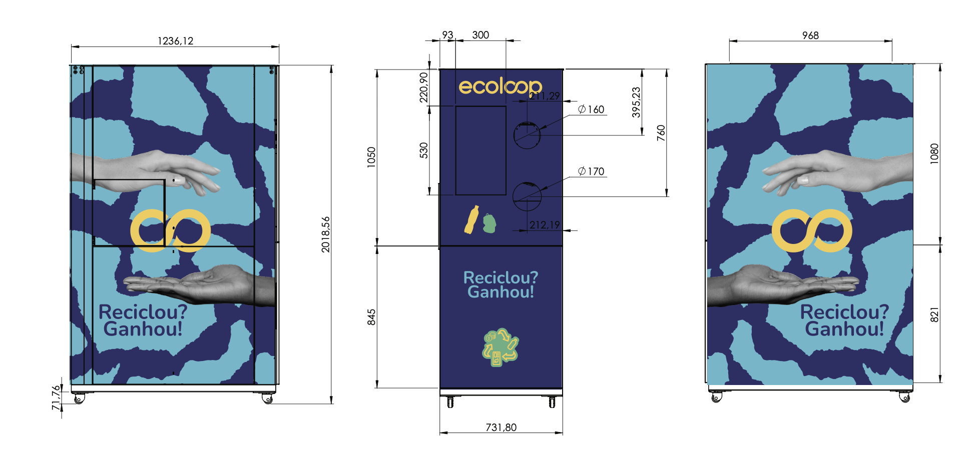
EcoLoop was already doing the work: intelligent waste collection, reverse logistics, circular economy solutions at scale. The brand just hadn't kept up with the ambition behind it. Their most visible touchpoint, the recycling machines themselves, weren't making the impression the mission deserved.
That was the problem. Visibility was the brief.
Client
Ecoloop
Sustainability
Circular Economy
Industry
Visual Identity
Product design
Services
Cynthia Bifani
Kalyl Kadri
Copywriting
Creative Direction
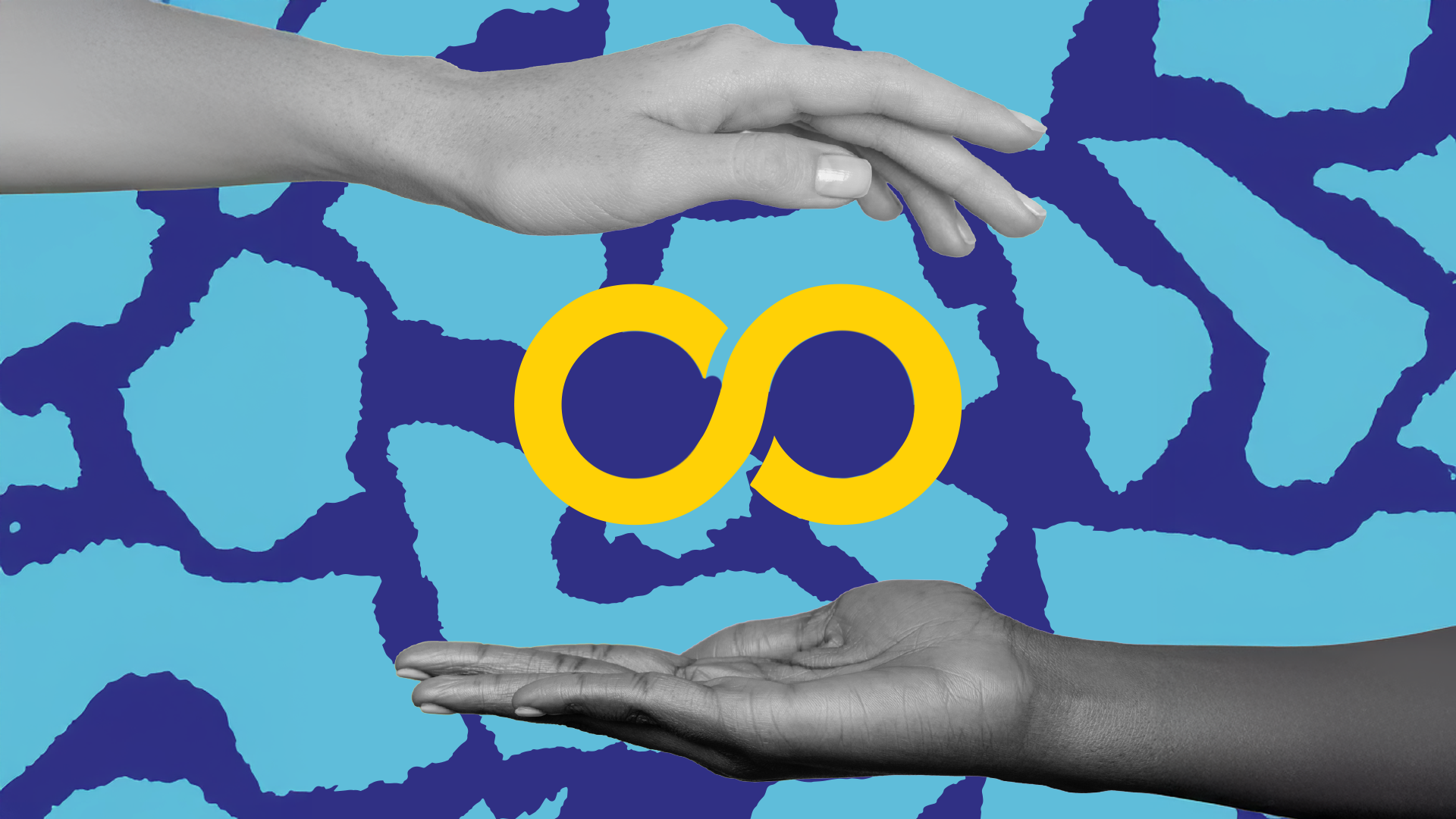
A brand doing important work deserves to look like it.

The Situation
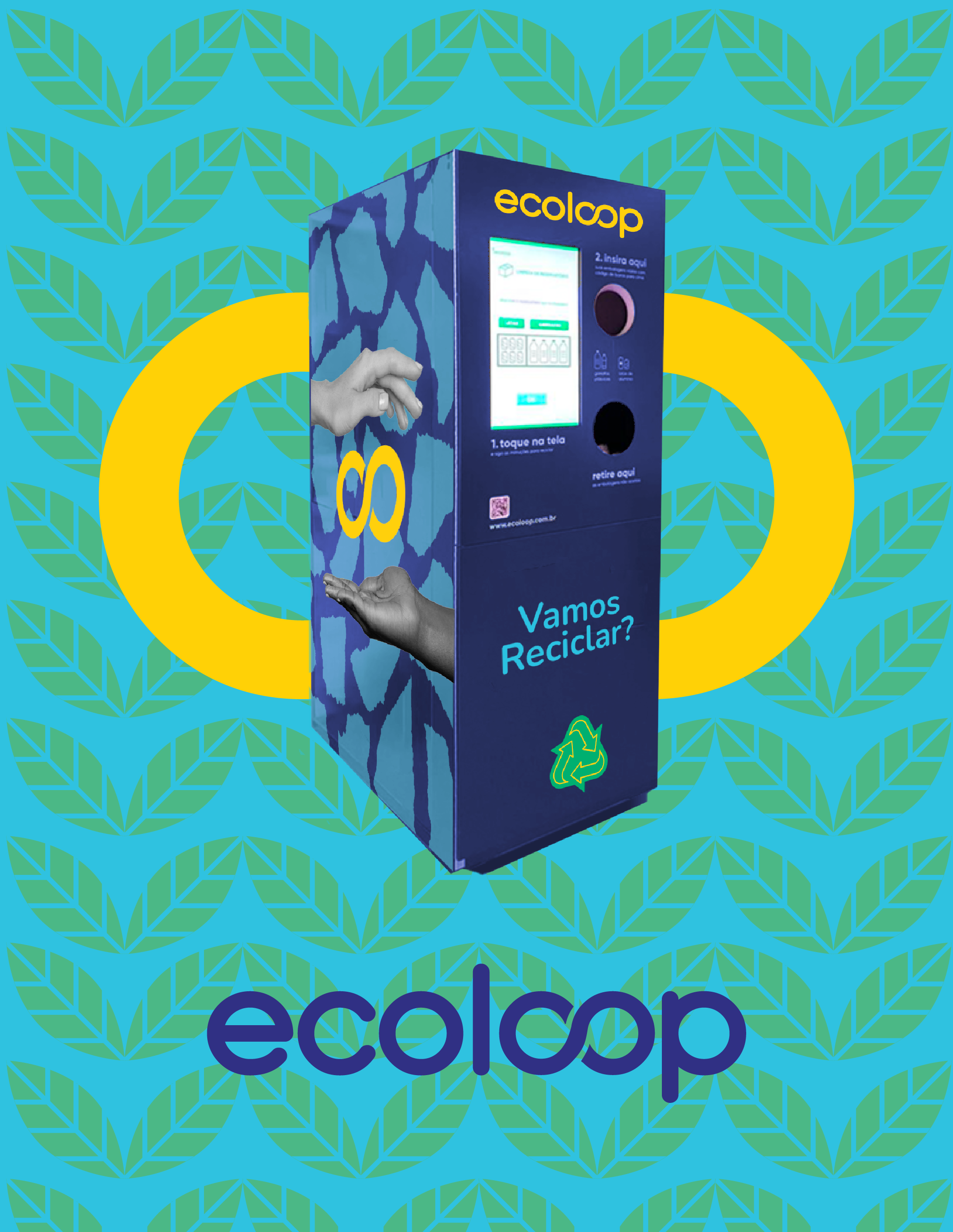
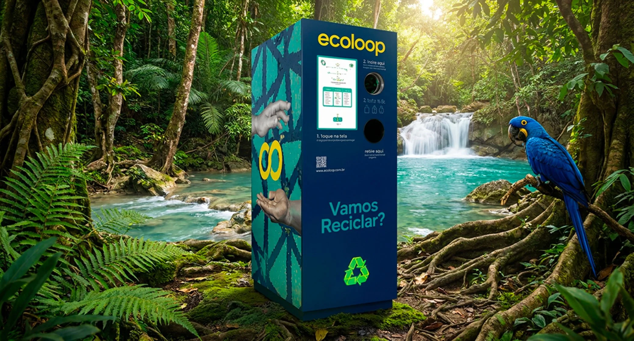
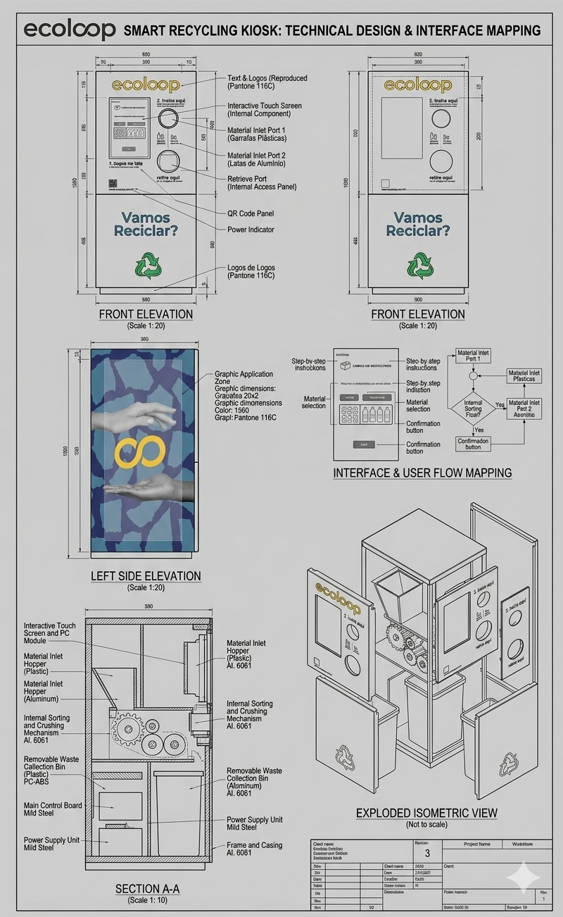
EcoLoop is a Brazilian company with a serious mission: intelligent waste collection, reverse logistics, and circular economy solutions. The work was meaningful. The brand hadn't kept pace. Their identity lacked consistency and visibility, and their recycling machines, the most public-facing part of the entire operation, simply didn't stand out.
They came to us ready for a change.
The CHALLENGE
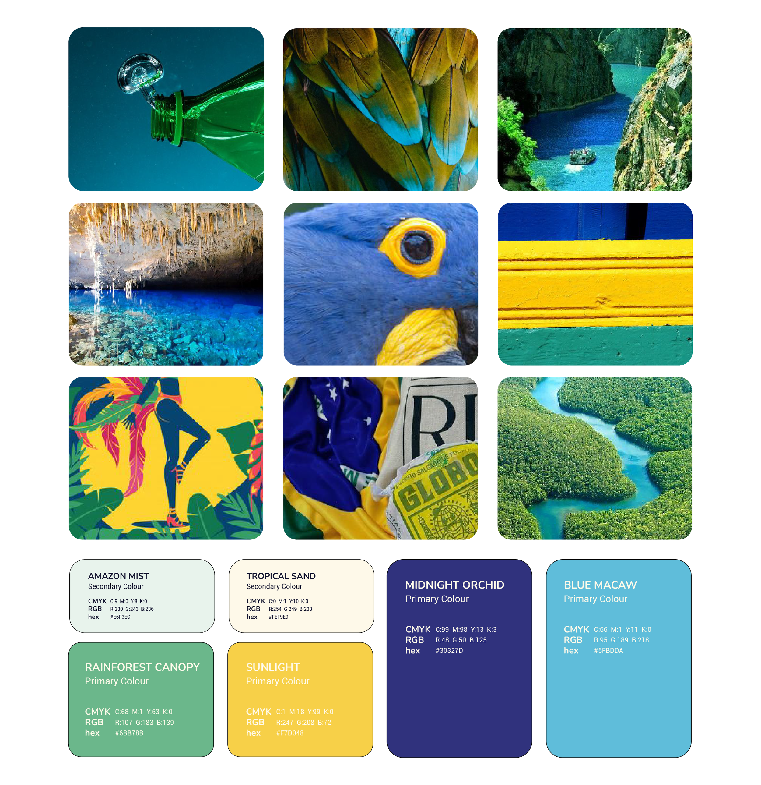
A sustainability brand has a particular set of tensions to navigate. It needs to feel responsible without feeling worthy. Social and vibrant without losing credibility. Brazilian in spirit without leaning on cliché. And it needs to work at scale, across digital, print, and large-format physical installations like recycling machines in public spaces.
Visibility was the non-negotiable. These machines needed to be seen.
WHAT WE DID
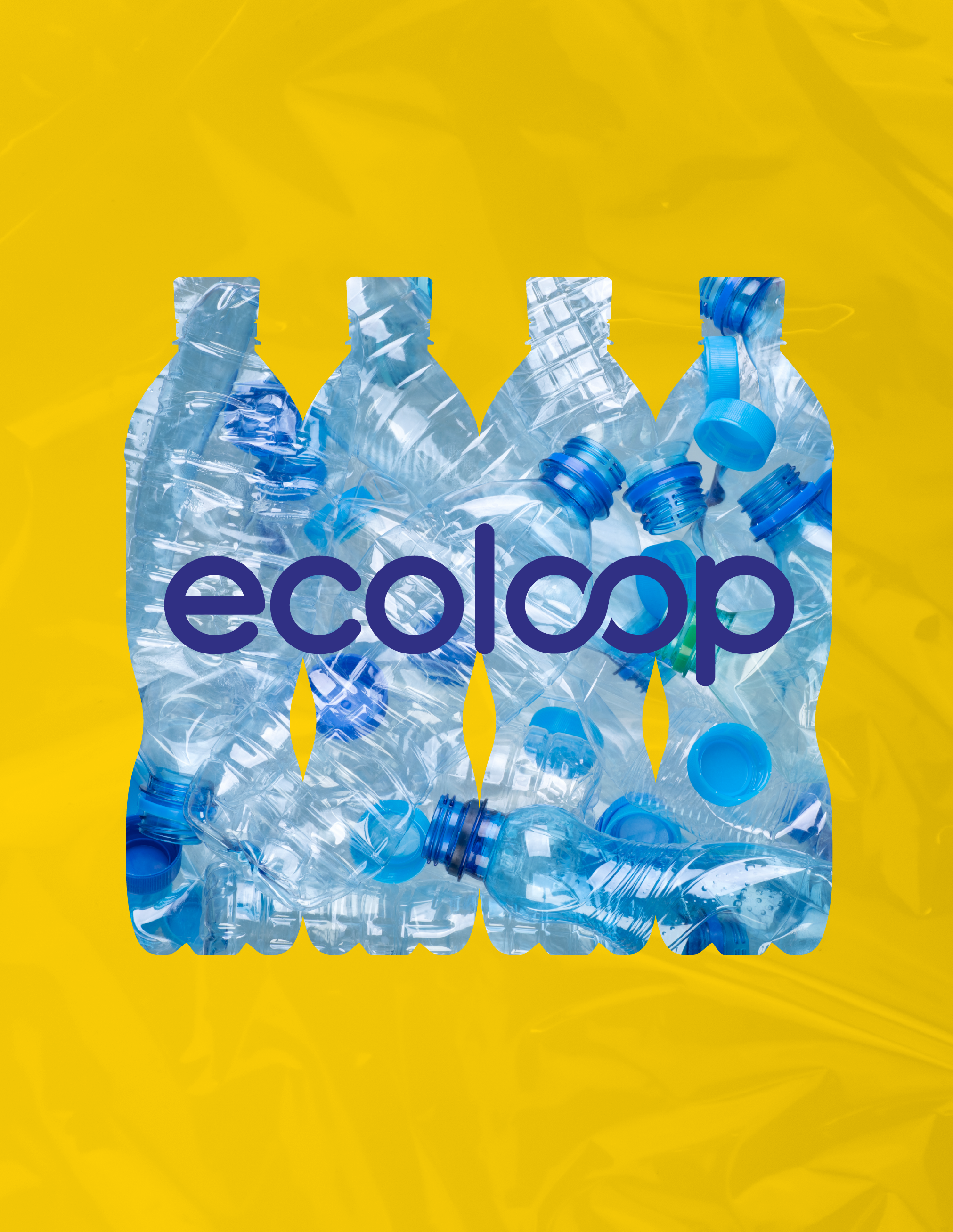
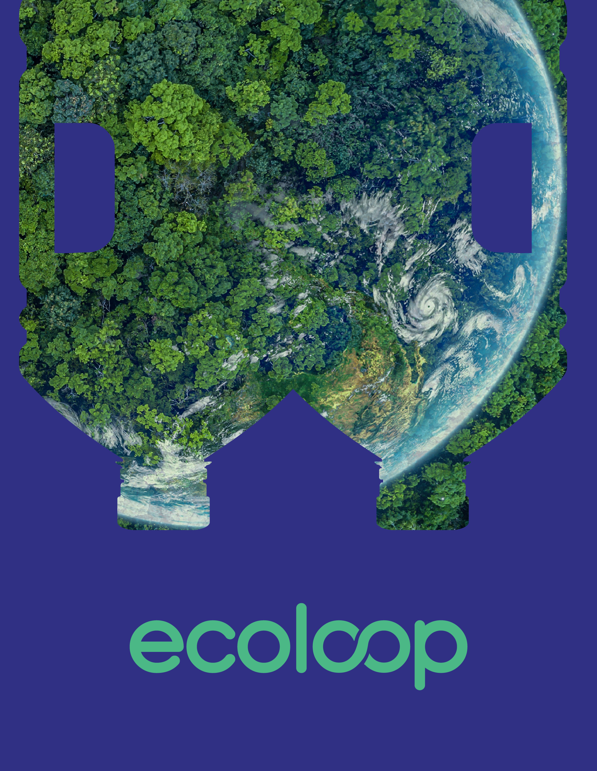
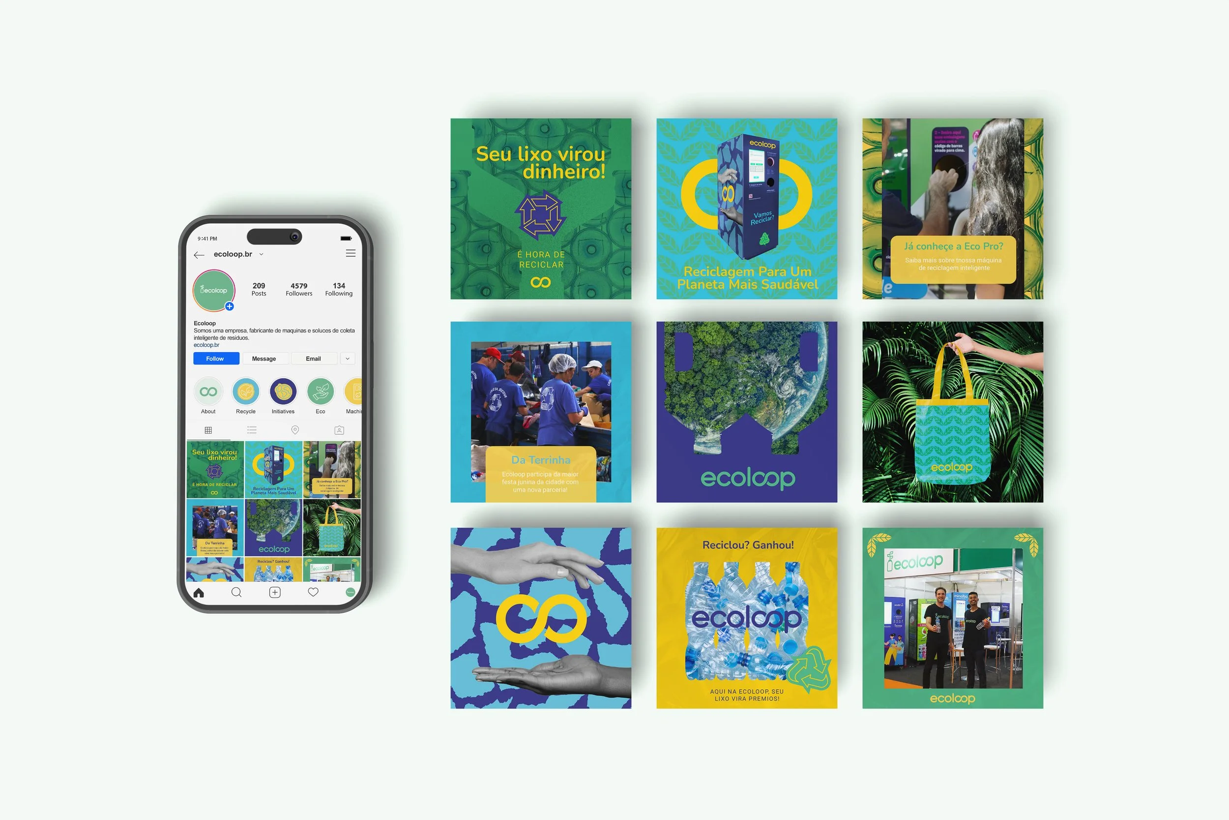
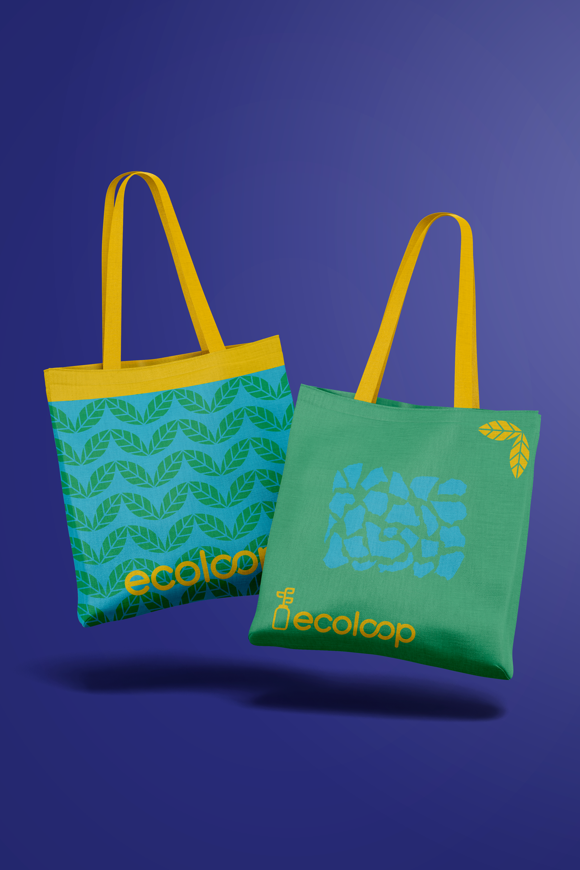
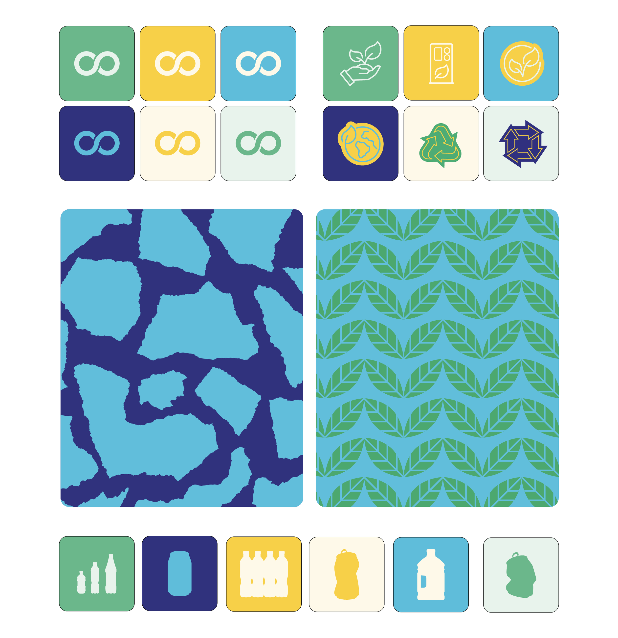
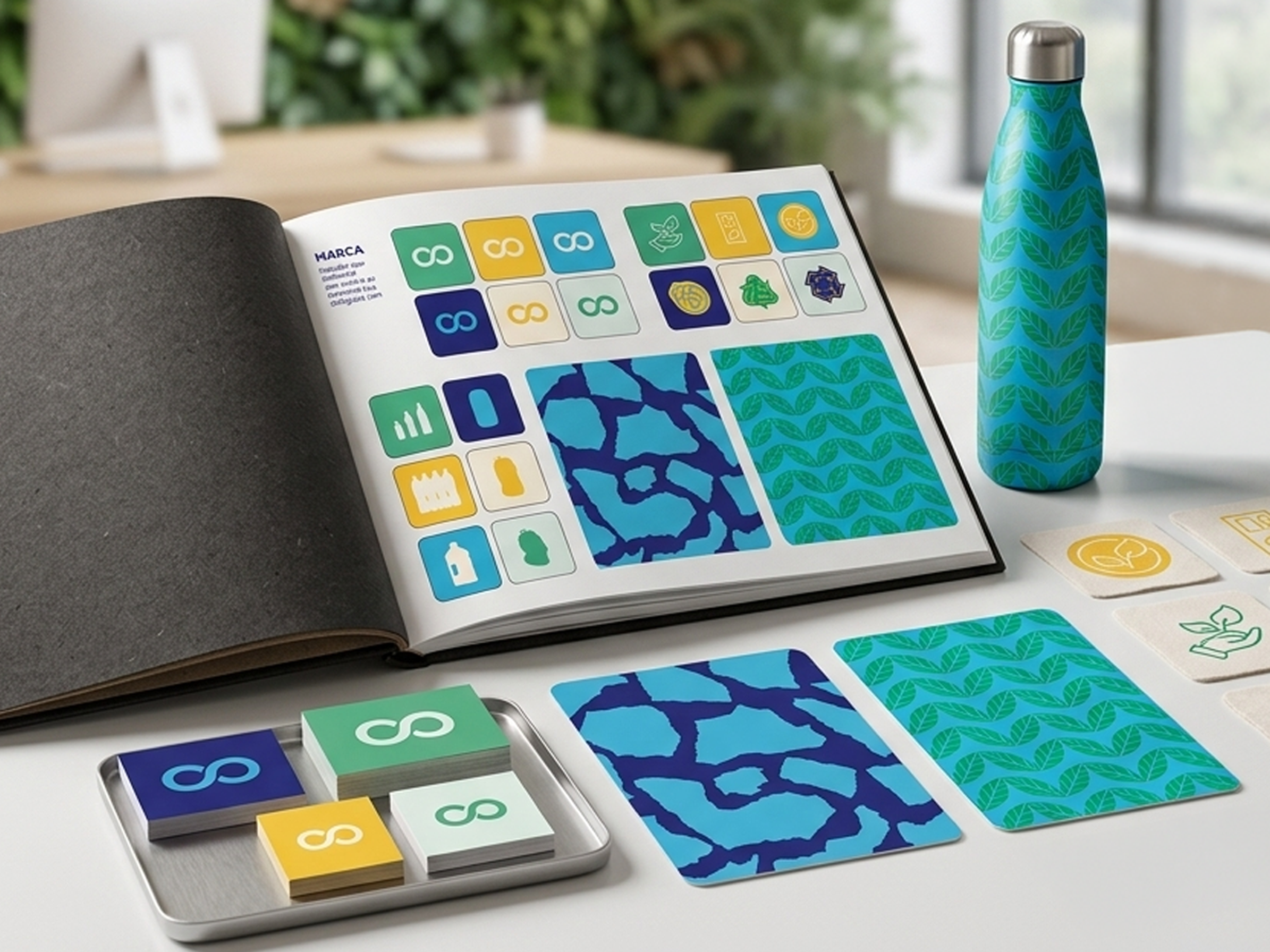
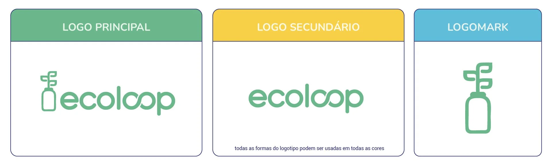
We delivered a full Brand Identity: visual system, brand guidelines, social media assets, and a complete redesign of the recycling machines themselves. The new identity brought energy and consistency to every touchpoint, with a dynamic visual language that could hold its own in the public spaces where EcoLoop operates.
The brand guidelines document was built to last: a comprehensive reference that gave the team everything they needed to maintain consistency independently.
THE RESULT
The rebrand delivered what it promised: a clean, complete, and energetic identity that positioned EcoLoop as a serious player in the sustainability space. The machine redesign gave the brand genuine visibility in the environments that mattered most.
A dynamic brand, built properly, and proof that sustainability and visual ambition are not mutually exclusive.
The feeling: Energetic, young, and built for the world it's trying to change.