
stop blending in.
time to show up.
You know who you are and who you are for. Now you need a visual identity that actually shows it. Coherent, considered, and distinctive enough to earn its place in the market.
Choose your starting point
Two options. One standard of work.
OPTION 01
Brand refresh
For businesses that know what they are, but need the visuals to catch up. A clean, considered brand refresh that gives your existing brand a boost quick.
INCLUDES
From €950
2 to 3 weeks
Primary logo and secondary mark
Colour palette with usage notes
Typography selection and pairing
Basic brand usage guidelines, no printing assets
DEPOSIT
50% ON SIGNING
OPTION 02
Brand IDENTITY
Price upon request
2 to 3 weeks
Your full visual world, built properly. Everything you need to show up consistently across every touchpoint, with a system designed to hold up as the business grows.
INCLUDES
Moodboard
Logo suite (primary, secondary, favicon)
Colour system with usage rules
Typography pairing + hierarchy
Brand guidelines document
Applied to 3-4 real touchpoints (packaging, banner, stationery, or any of your choosing, including their printing files)
Basic social media refresh (Profile image, highlights)
Full brand book
DEPOSIT
50% ON SIGNING
* Not every deliverable listed applies to every project. We scope each engagement around what your brand actually needs. If something is not relevant to your situation, we will tell you upfront and you will quoted accordingly.

What's included in both
Regardless of where you start, the process is the same.
Discovery Session
01
Every project starts with a proper conversation. Your business, your audience, your brief. We read it carefully before we touch anything visual.
Three Design Concepts
02
Not one direction handed down. Three considered concepts, each with a clear rationale. You respond honestly. We go from there.
Two Revisions rounds
03
Enough space to get it right. Not so much that the work loses its conviction. After two rounds, further changes are scoped separately.
Final File Handover
04
All formats you need, properly organised and labelled. Vector files, print-ready assets if applicable, web formats. No loose ends on delivery.
Handover Call
05
We walk you through everything on delivery. How to use it, what to avoid, and what to come back to us for as the brand evolves.
30 Days of Support
06
Questions after delivery are part of the job. For 30 days after handover, we are available for guidance on how to apply the brand correctly.
brand identity
Six weeks, clear stages.
week 01 - Discovery
We get to know your brand, your market, and where you want to go. The brief is everything. We take it seriously.
week 02/3 - design
Three logo concepts, each with a clear rationale. You will know why each one exists, not just what it looks like.
week 04/5 - Refinement
The chosen direction applied across your world. Colour, typography, imagery, real-world contexts. The system comes together here.
week 06 - Delivery
Final files, brand guidelines, and a handover that actually sets you up to use the brand properly. No loose ends.
*All timelines are indicative and depend on the responsiveness of both parties. Delays in feedback, approvals or content provision from the client's side will affect the delivery schedule accordingly. Late response fees may apply where project timelines are significantly impacted.
in practice
What it looks like when it works.
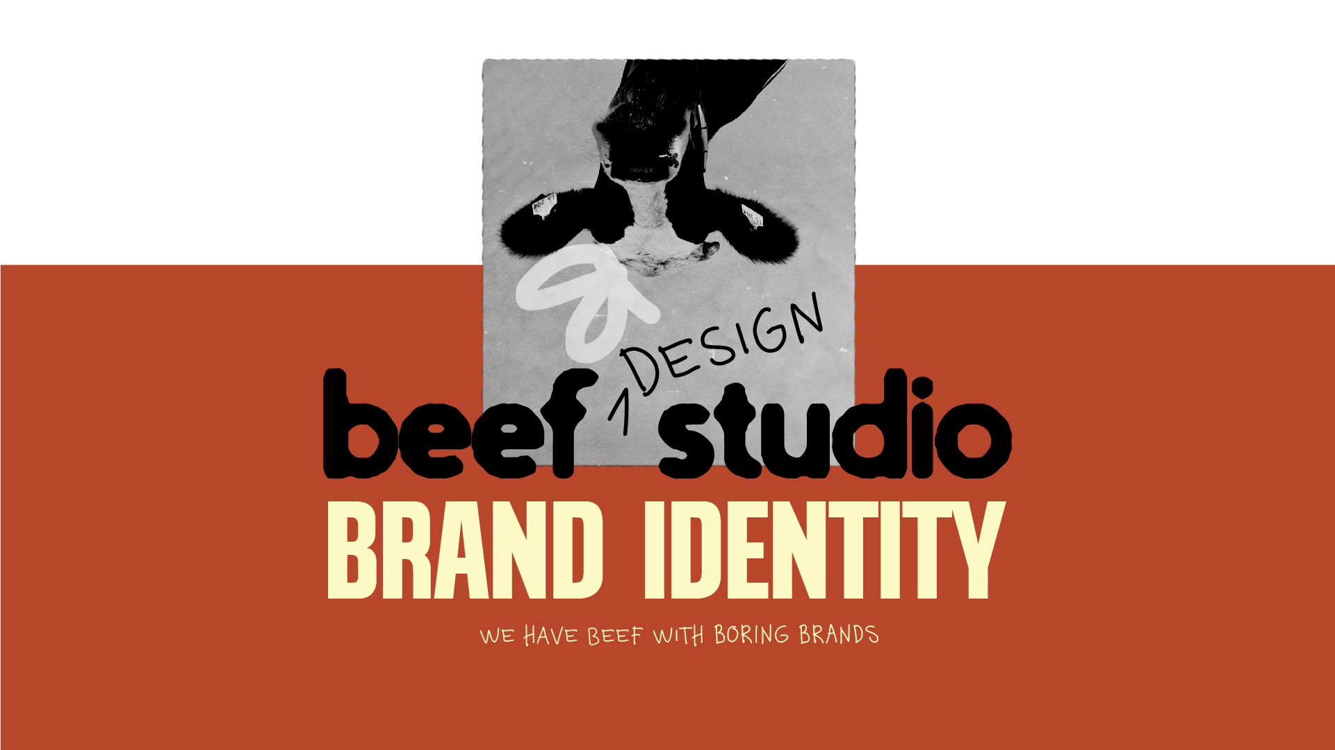
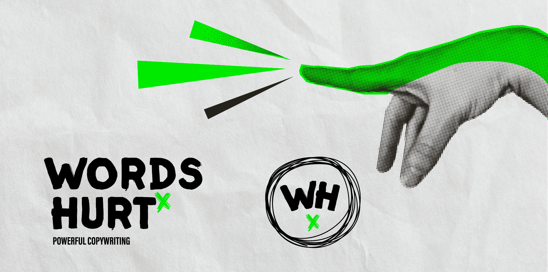
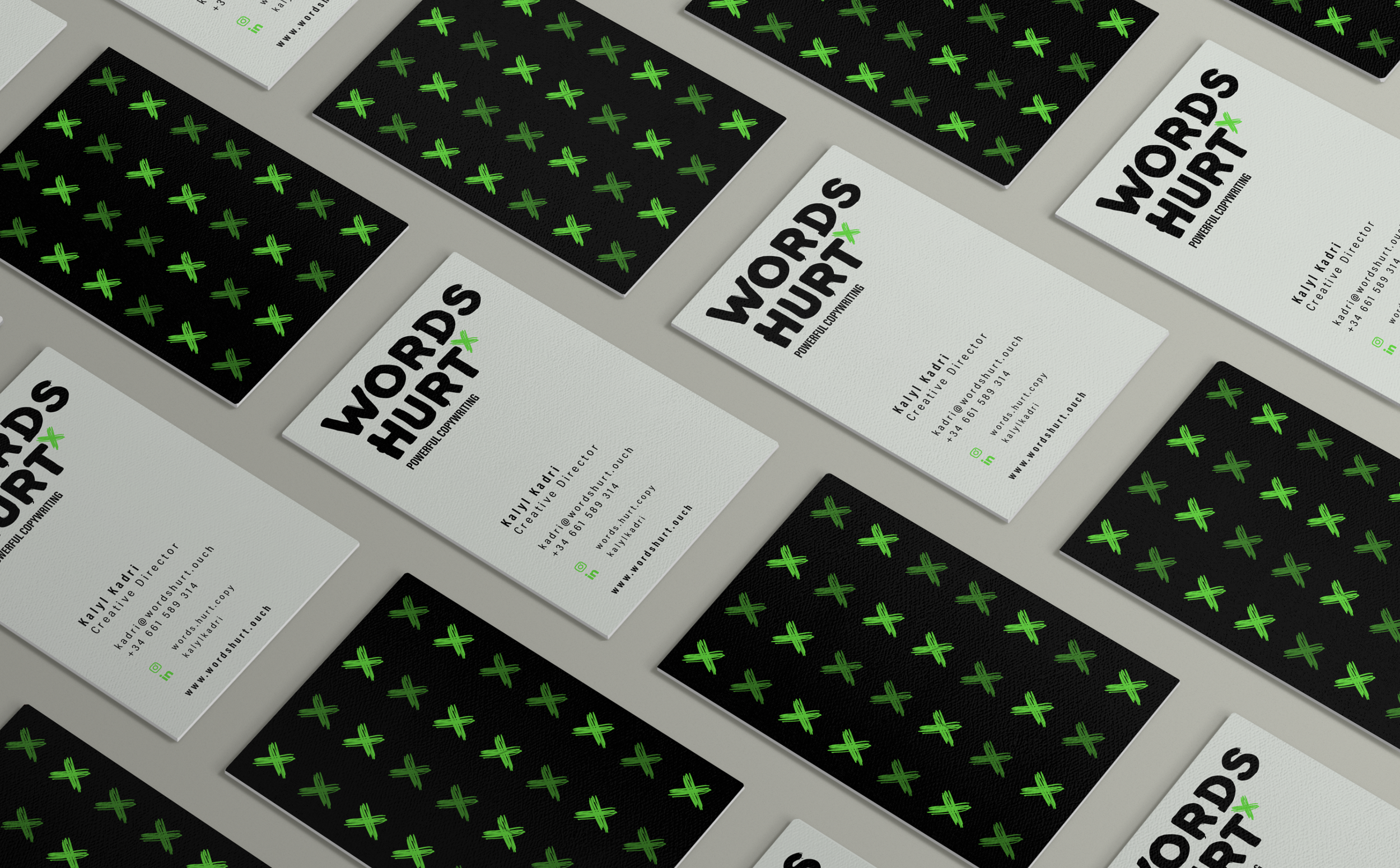
CLIENT
WORDS HURT
Brand identity ● Graphic Design
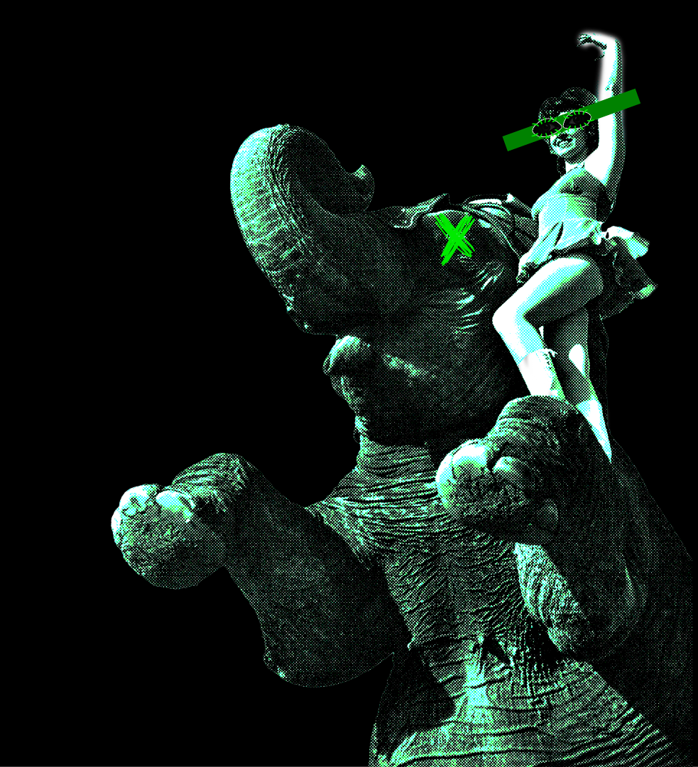
The founder arrived with something rare: a complete creative vision and the vocabulary to articulate it. A copywriting business built on whimsy, theatricality and the energy of performance. Our job was to build it without flinching. Full brand identity and pitch deck. Nothing hedged, nothing softened.
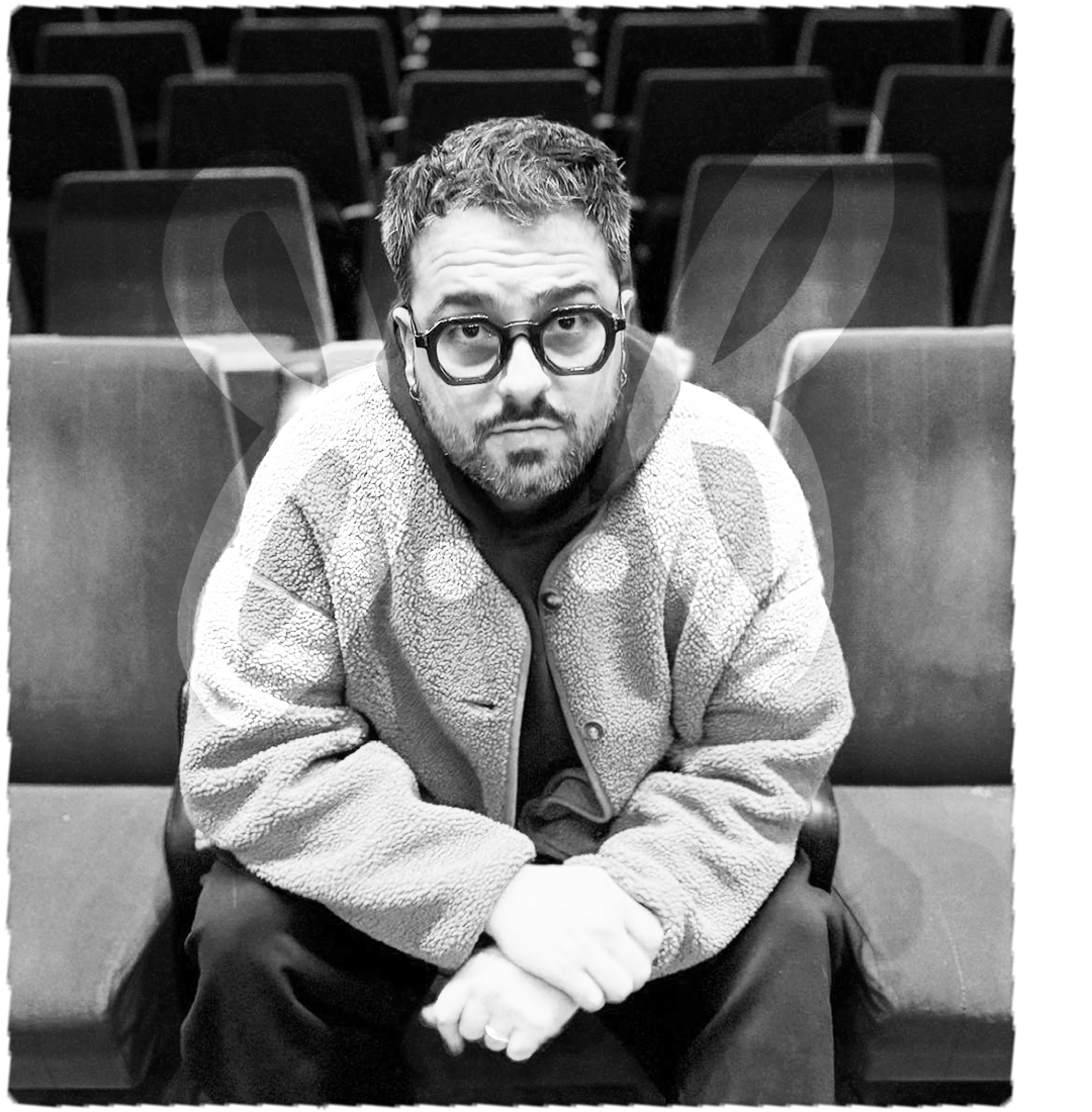
KALYL KADRI
Founder of Words Hurt“It’s been almost 3 years now and the visuals are still going strong because the brand they built was strategically created and intentional.”
CLIENT
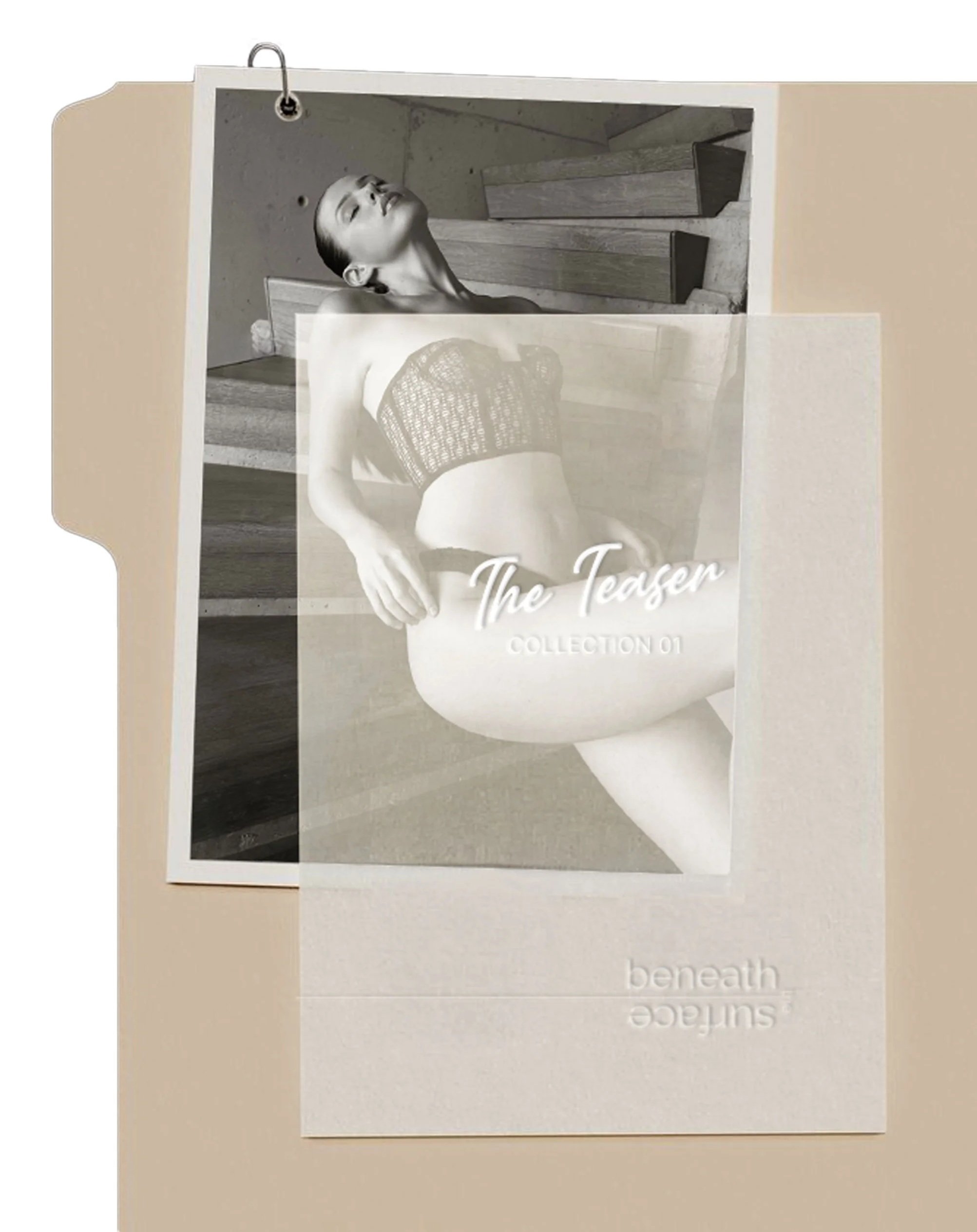
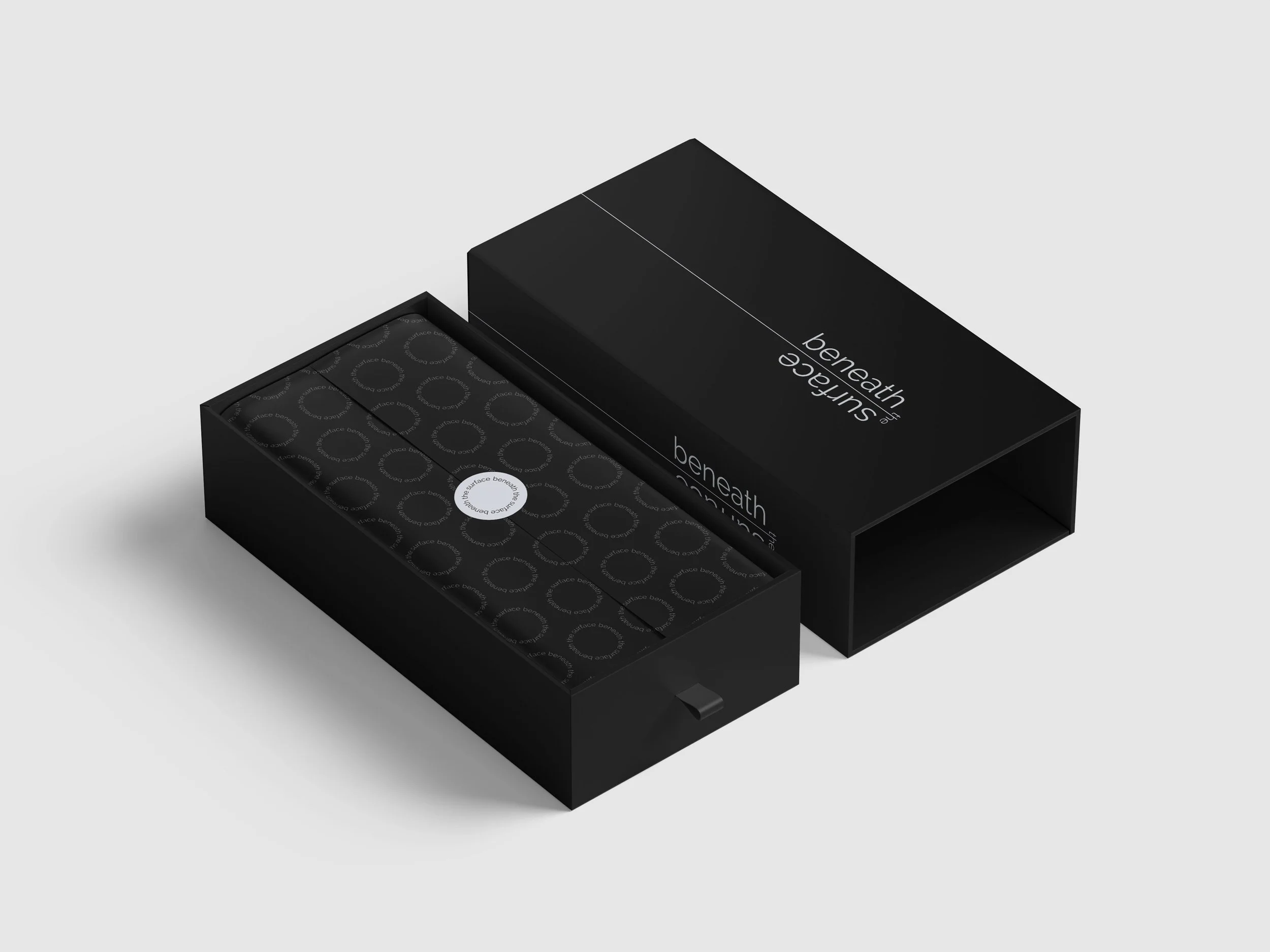
BENEATH THE SURFACE
Brand identity ● Packaging
The concept arrived fully formed. A luxury lingerie brand built on one premise: every piece black or white, nothing else. The founder knew what she wanted. She needed the craft to match the conviction.
A circular emblem. A logo with a line through it. Surface, depth, and what lies beneath. Nothing decorative. Everything intentional.
She has since produced multiple collections and maintained the brand with a consistency that is genuinely rare.

Andrea Daccak
Founder of Beneath the Surface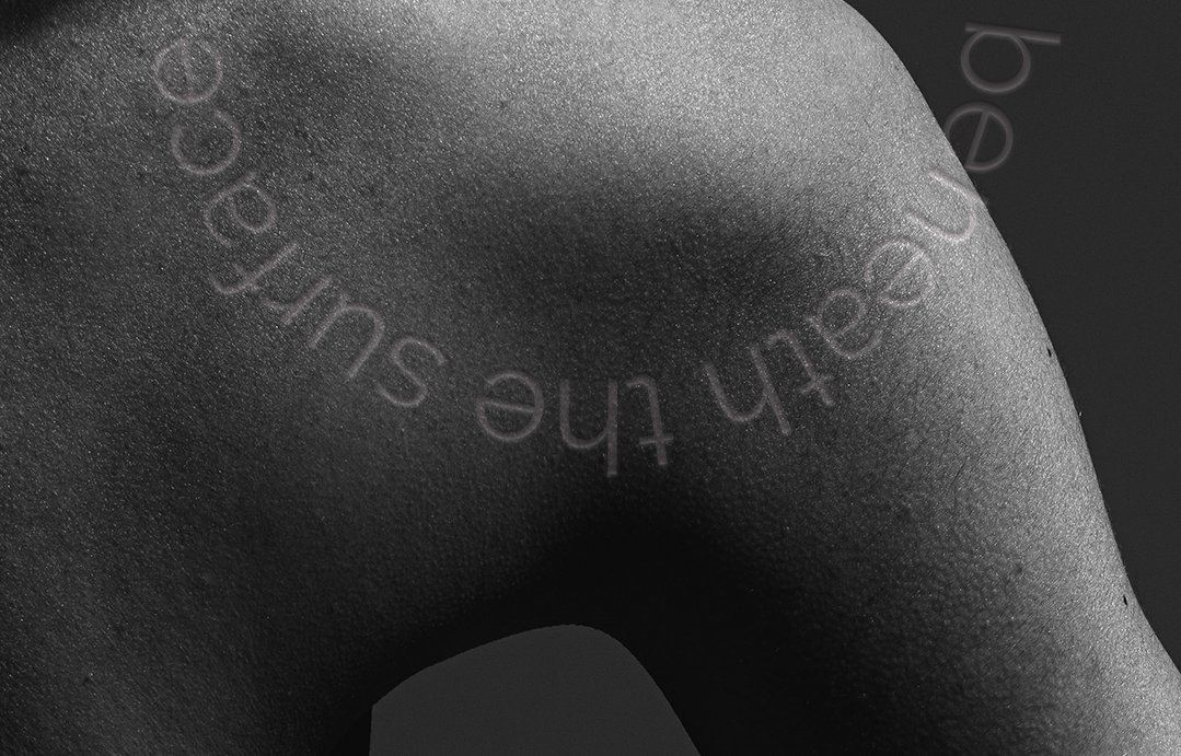
“They delivered something even better than I expected. They know how to take an idea and actually make it real without overcomplicating things.”
Your strategy is ready.
Your brand should be too.
If you know who you are and you are ready to look like it, this is the project.
Let’s talk.