BOUcles project
Info
Boucles Project had already done the hard part. Years building a product their customers loved, a community that trusted them, and a reputation in the curly hair space that was genuinely earned.
What they hadn't done was let their brand catch up. They came to us knowing they'd outgrown what their branding, and knowing exactly how much was at stake in changing it.
Here is the result.
Client
Boucles Project
Beauty
Customer Products
Industry
Strategy Research
Visual Identity
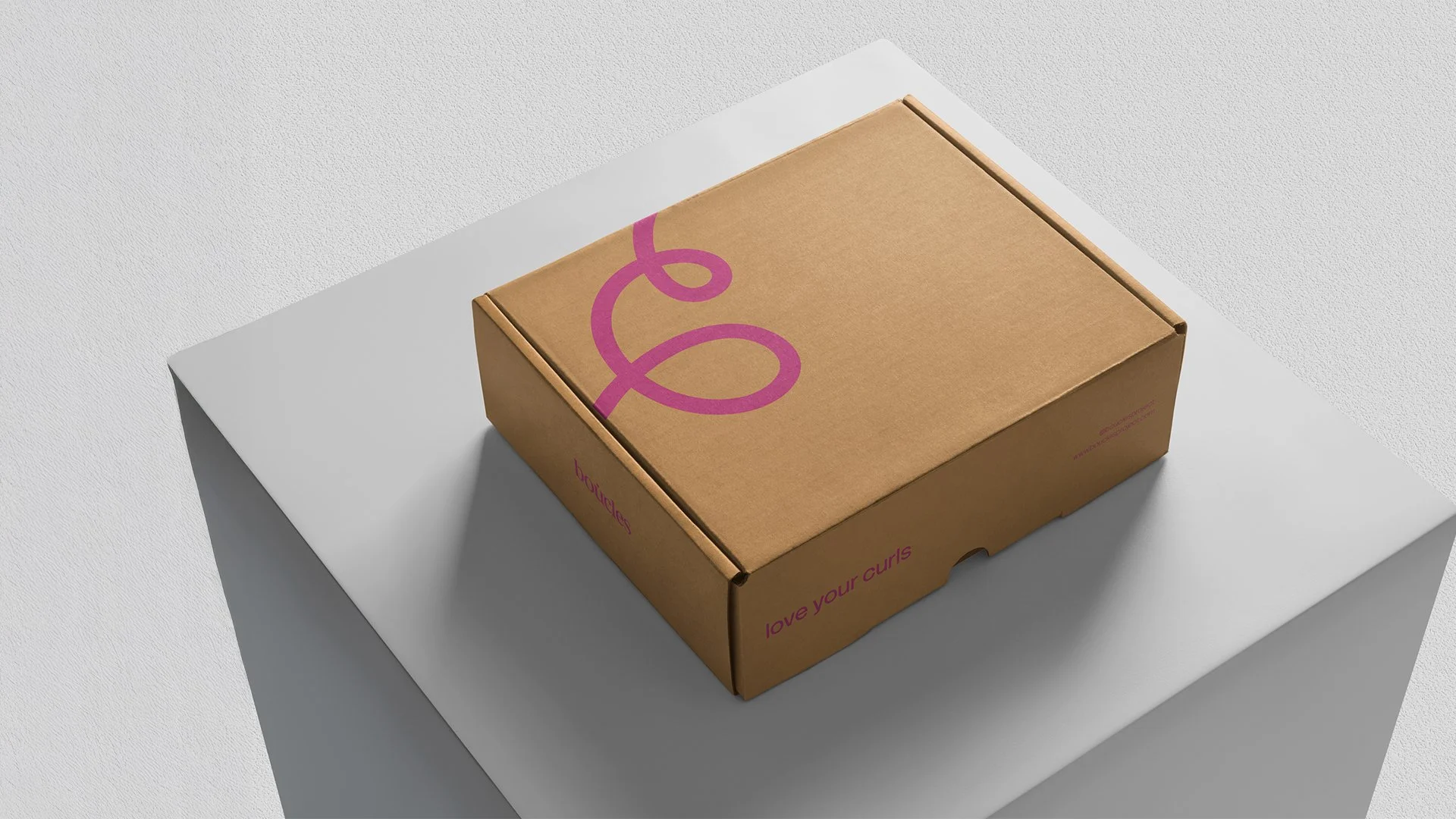
Packaging Design
Product Visualisation
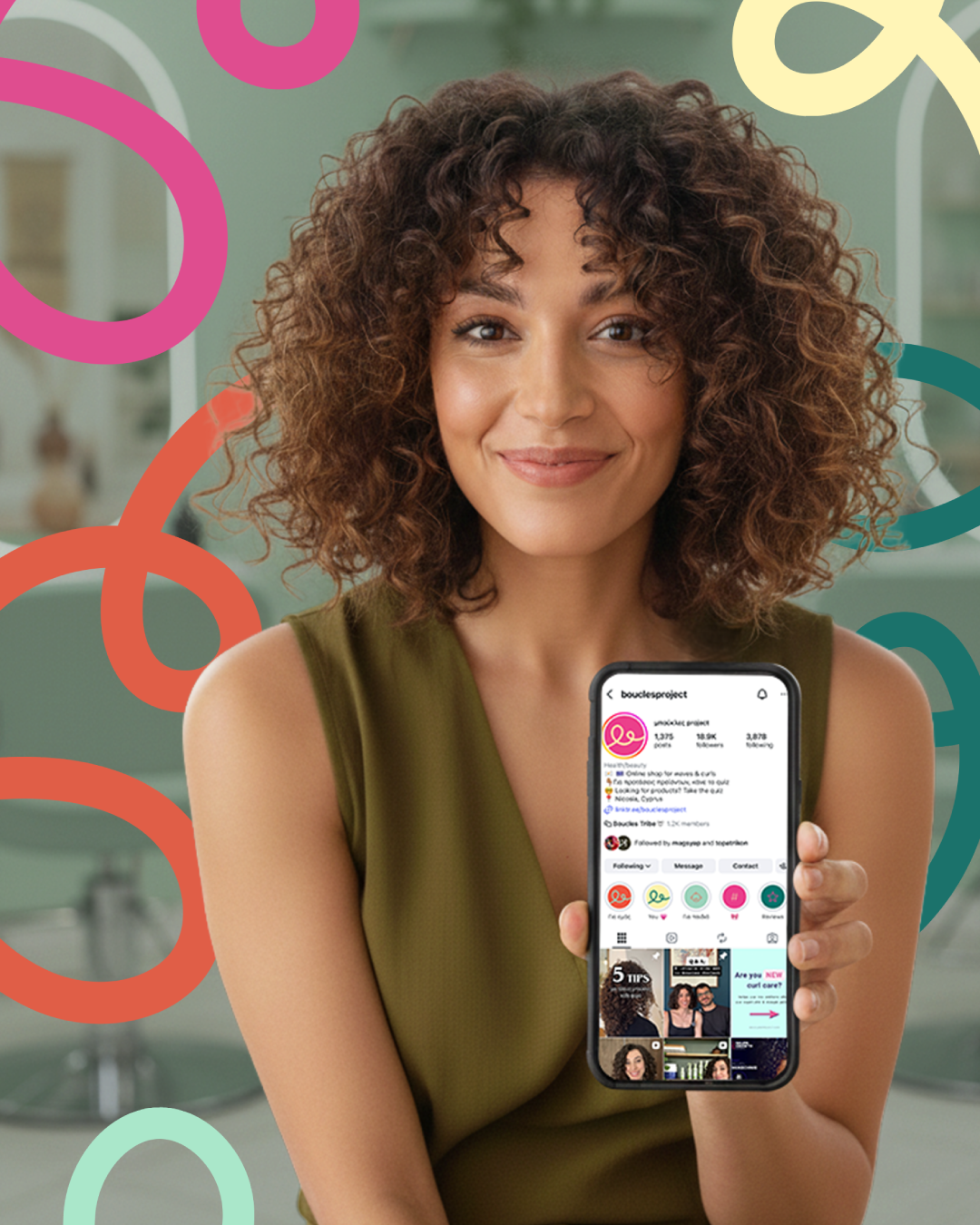
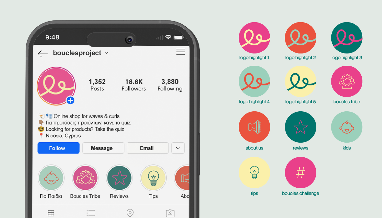
Social Media [re]starter kit
Key Visuals
Outdoors
Services
Cynthia Bifani
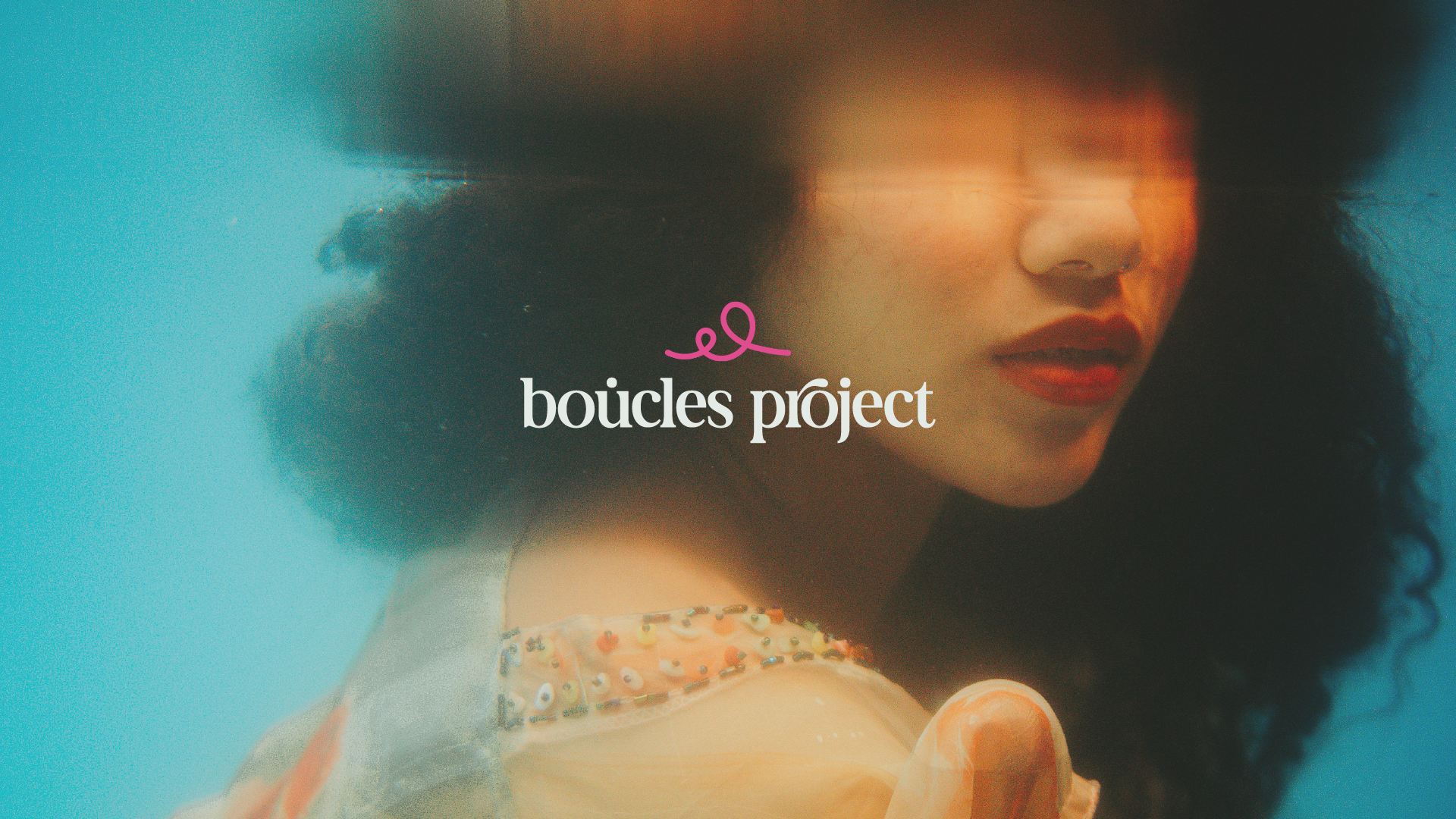
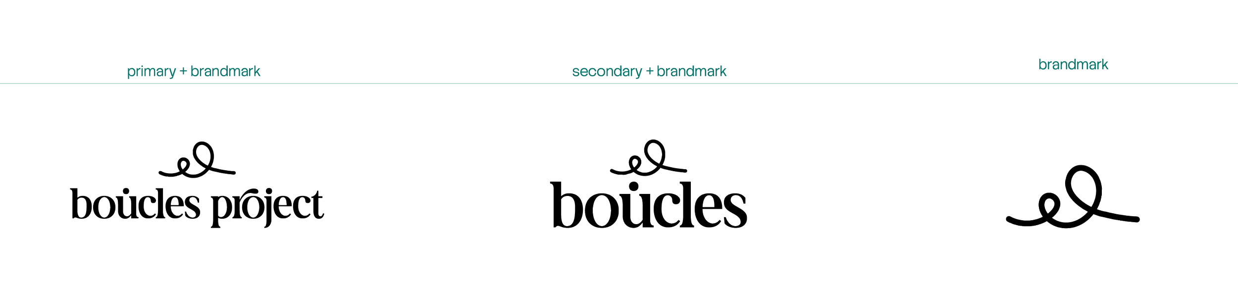
The brand had outgrown itself.
Time to catch up.
The Situation
Boucles came to us at a turning point. They'd built something real: a loyal community, a growing product range, a reputation in the curly hair space, but their brand had been put together quickly at the start, the way most brands are. It did the job then. It wasn't doing the job anymore.
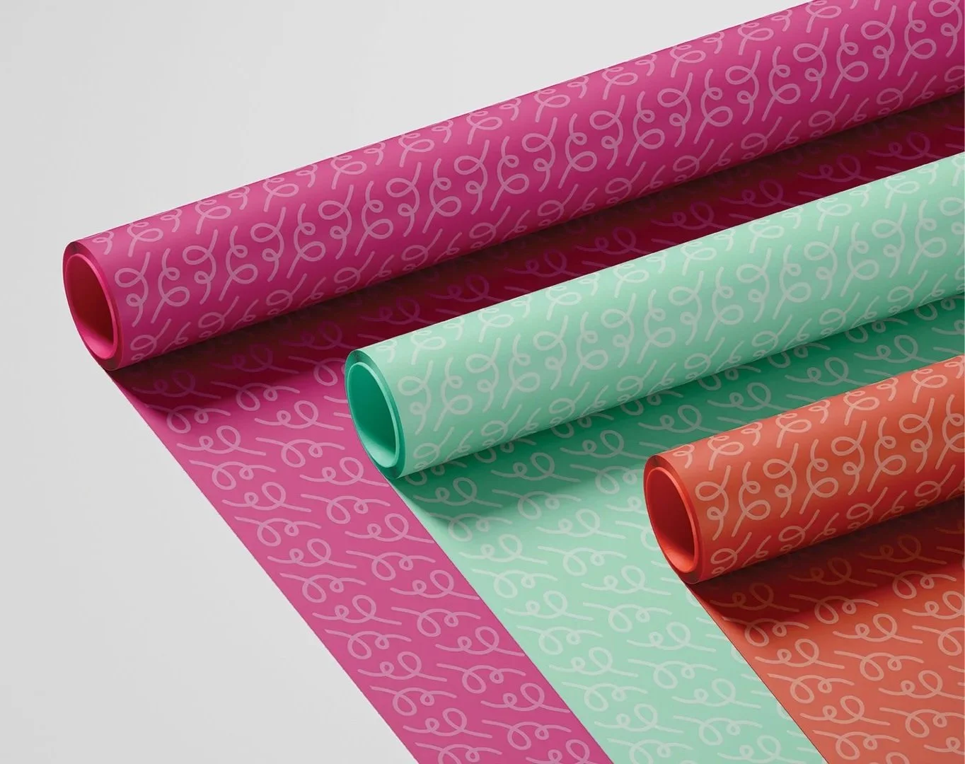
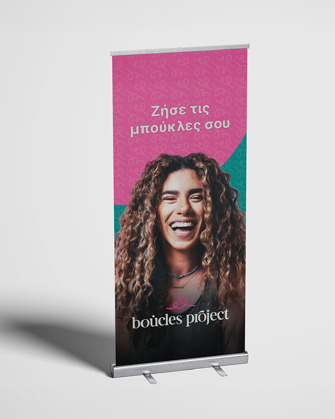
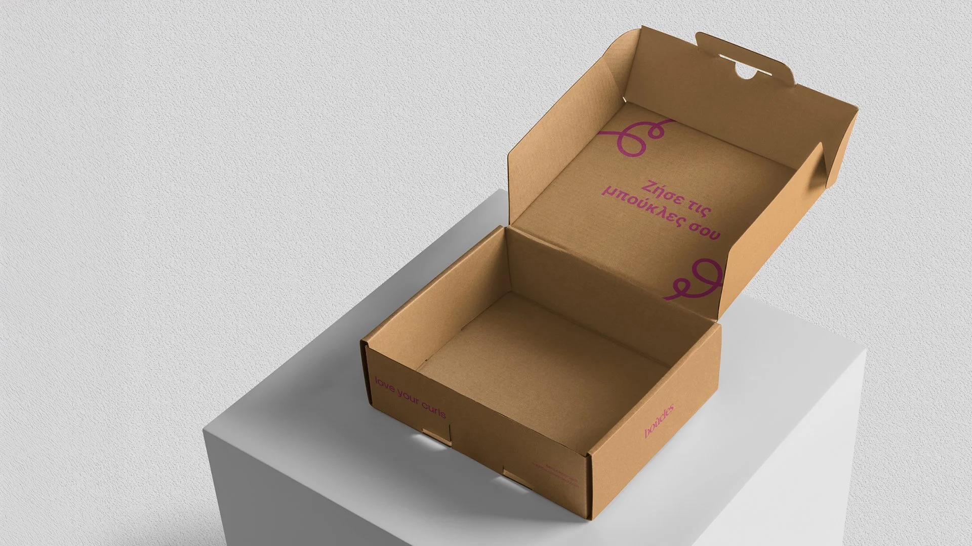
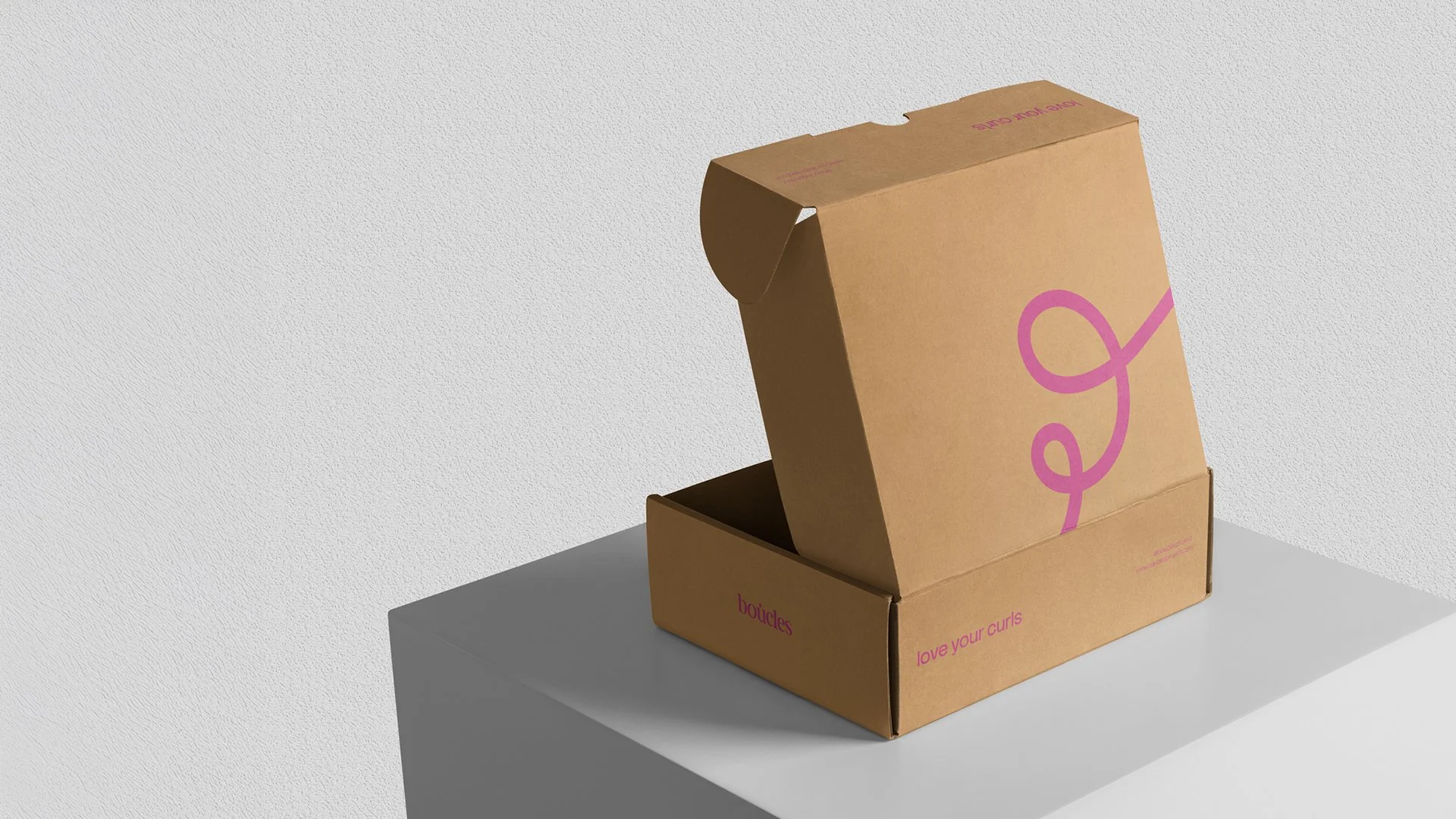
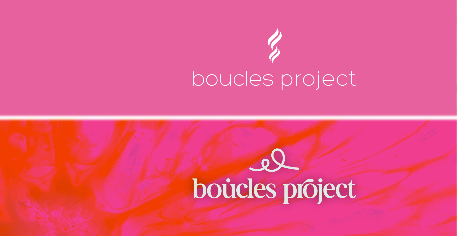
The ask wasn't to start from scratch. It was smarter than that: evolve the brand into something more considered and more premium, without losing the recognition they'd spent years building. Their customers needed to see themselves in the new brand immediately. And that signature pink wasn't going anywhere.
The CHALLENGE
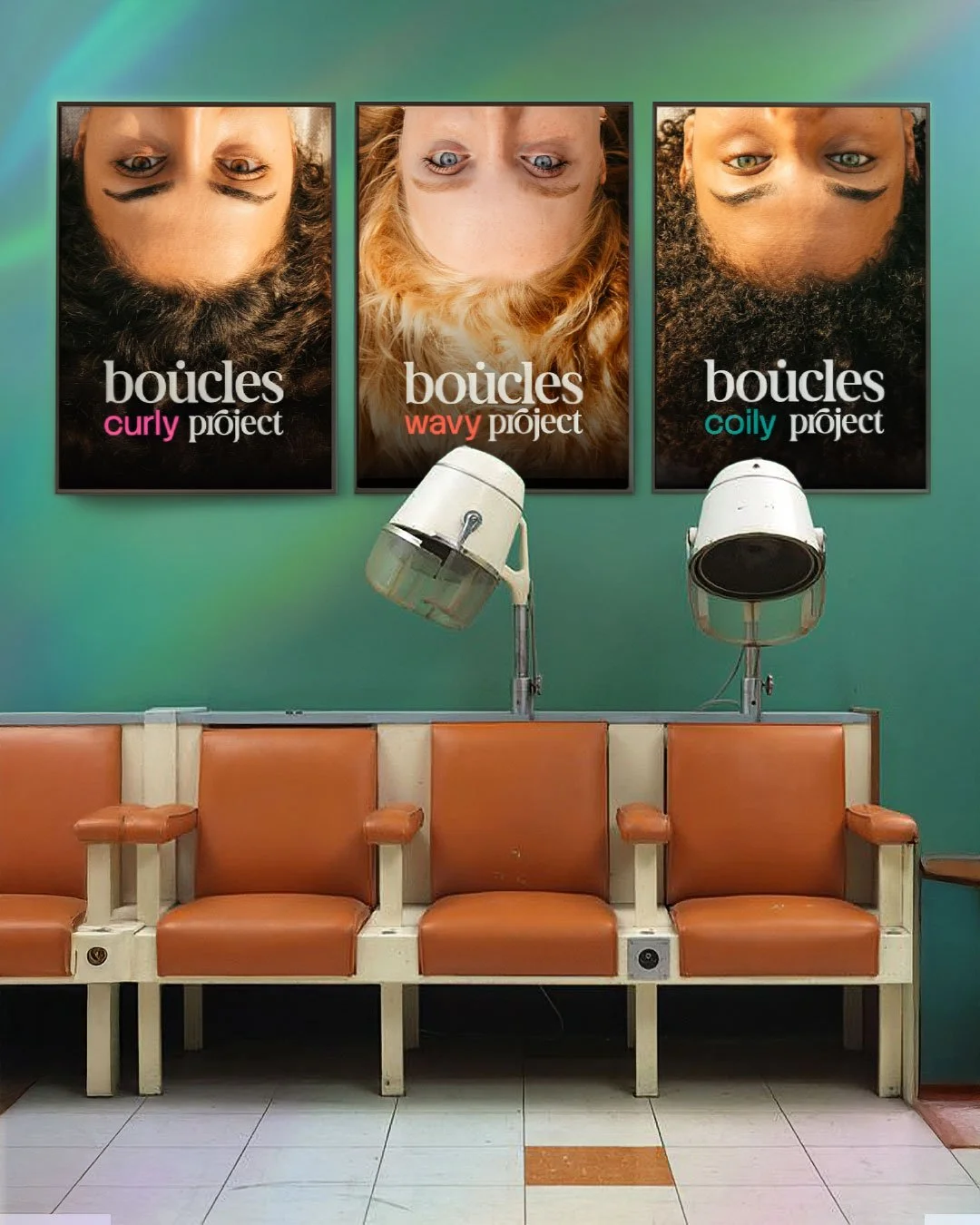
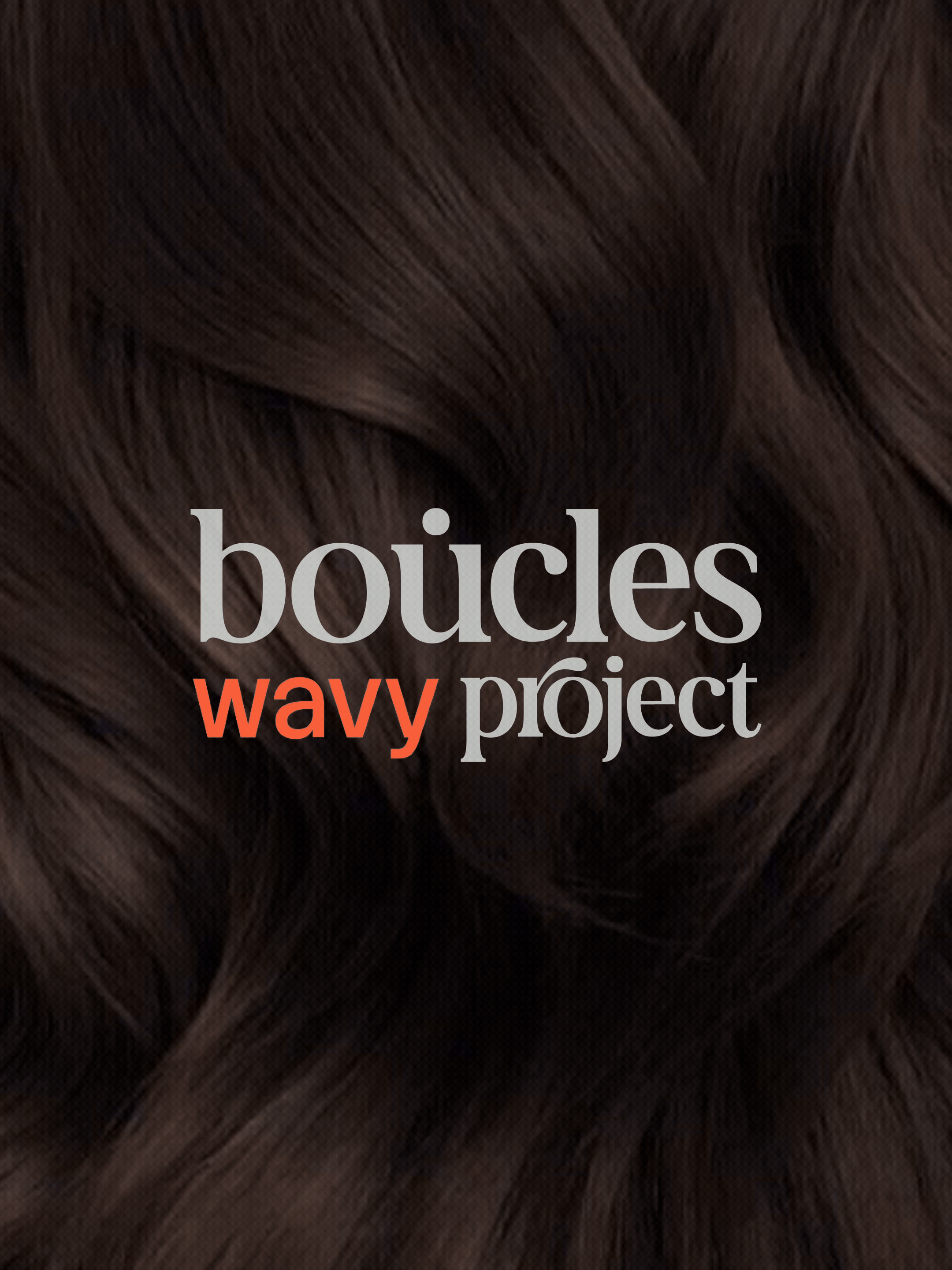
Boucles isn't just a retailer. They're an umbrella brand, a home for other brands to sit under, a destination for a community, a trusted name in a niche that runs on personal trust. The new identity had to carry that weight. Think less boutique, more Sephora. A brand with enough structure and confidence to hold a whole ecosystem under it.
Getting that right meant understanding not just what Boucles looked like, but what it stood for, who it was talking to, and where it was going.
WHAT WE DID
We ran the full Brand Universe process.
Starting from the discovery stage, we built three distinct mood directions, each a different interpretation of where the brand could go, giving the clients a genuine creative decision to make, not just a single direction to approve.
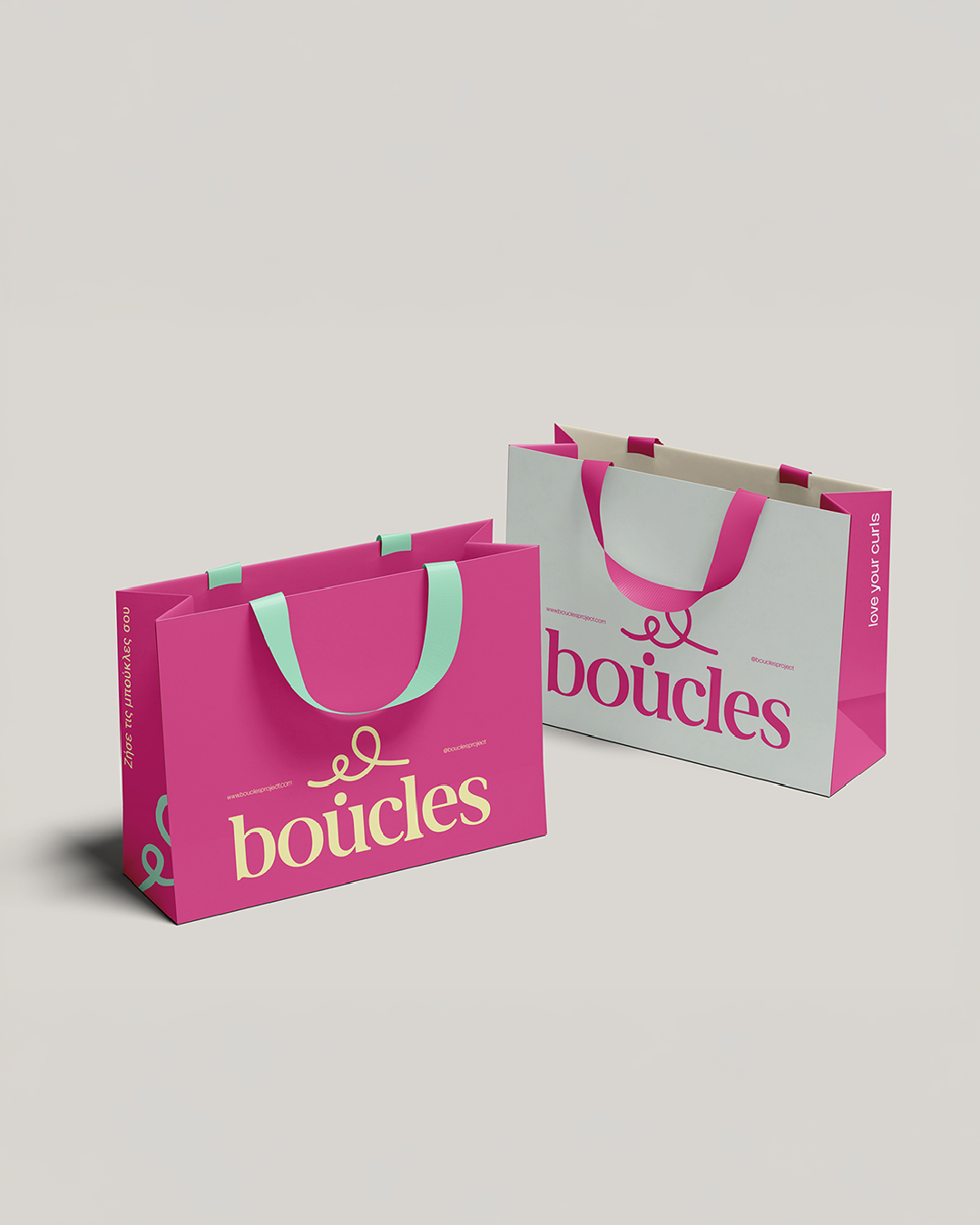
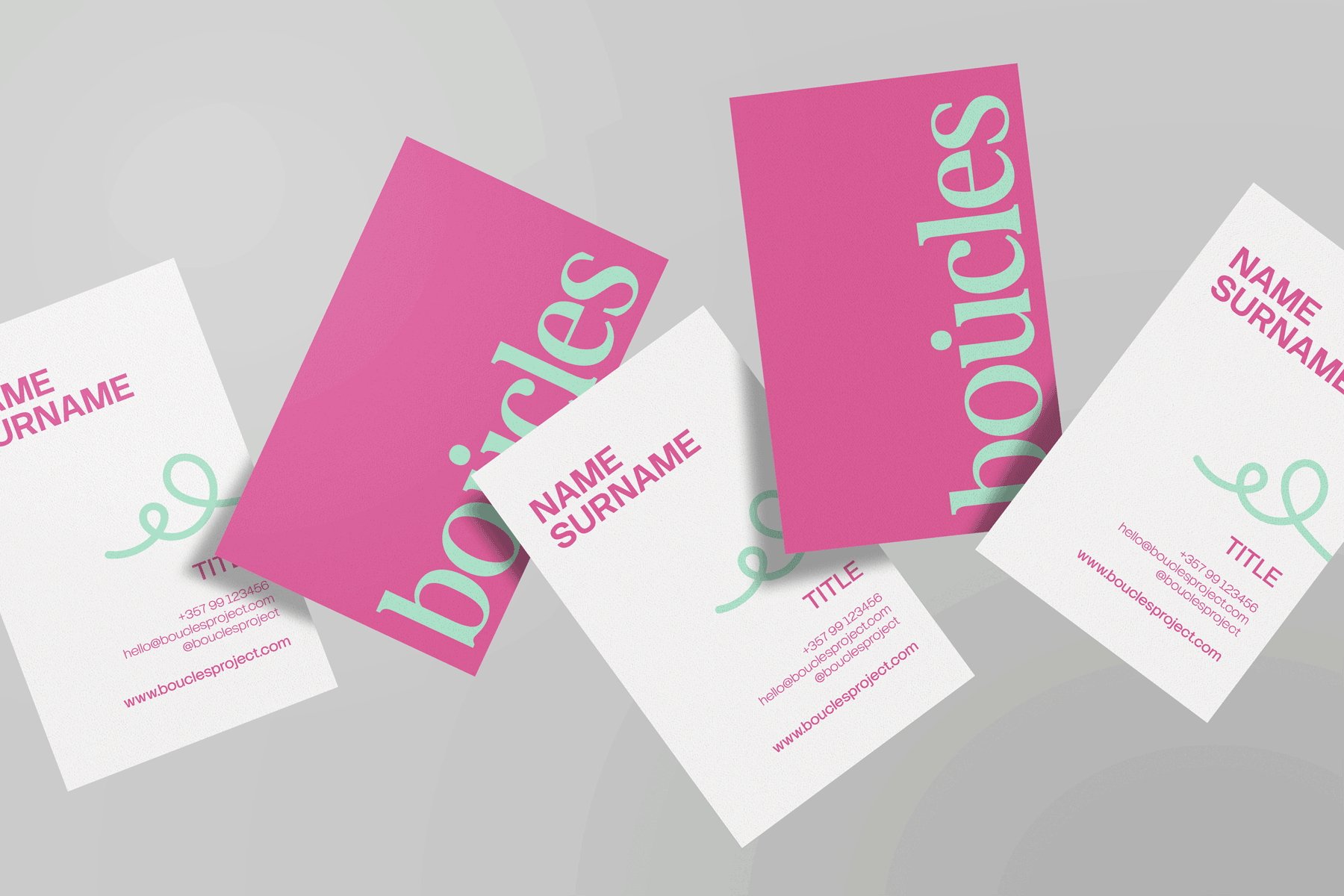
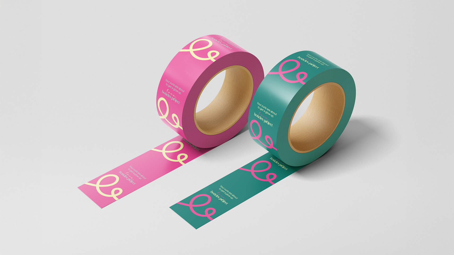
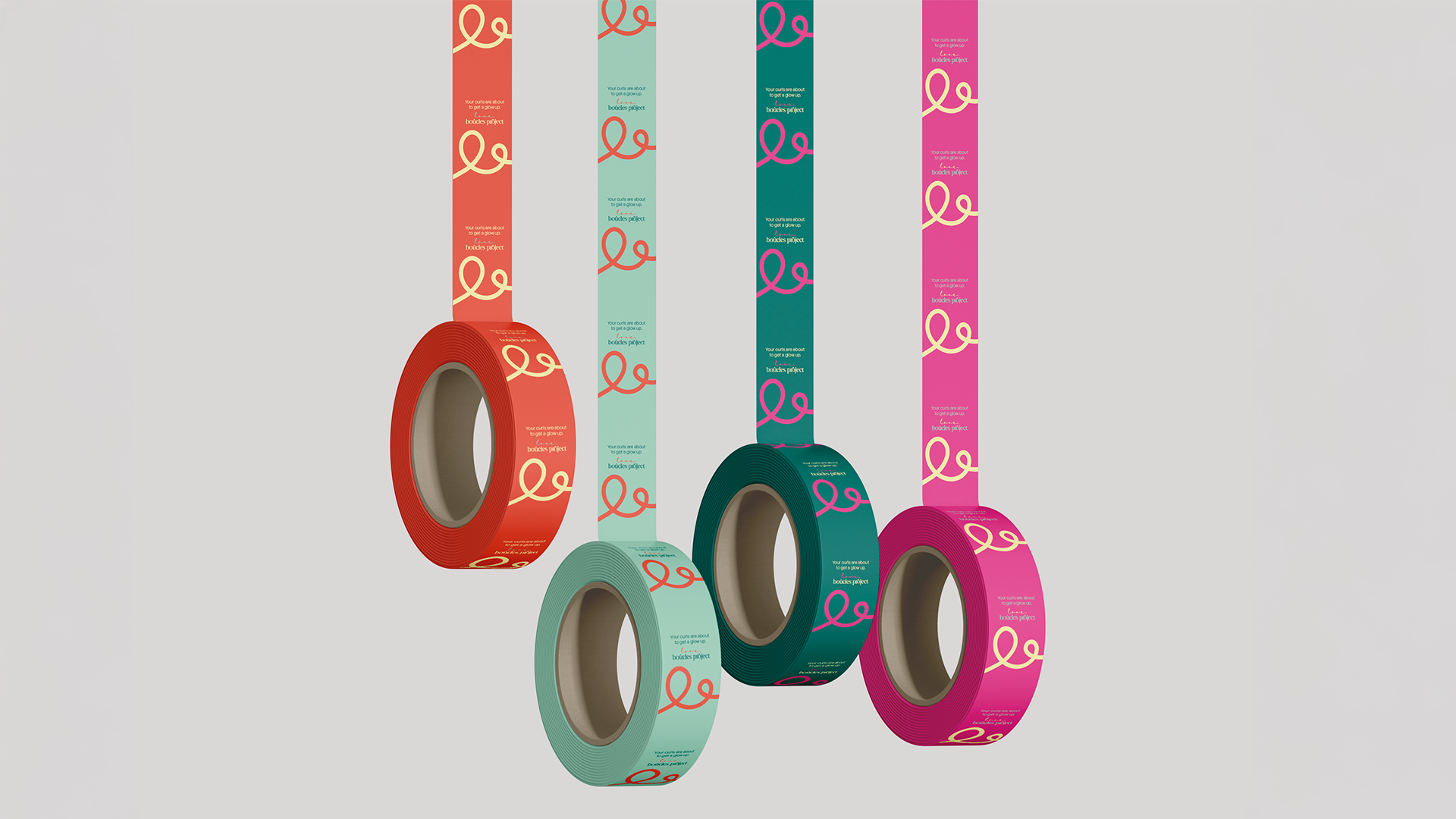
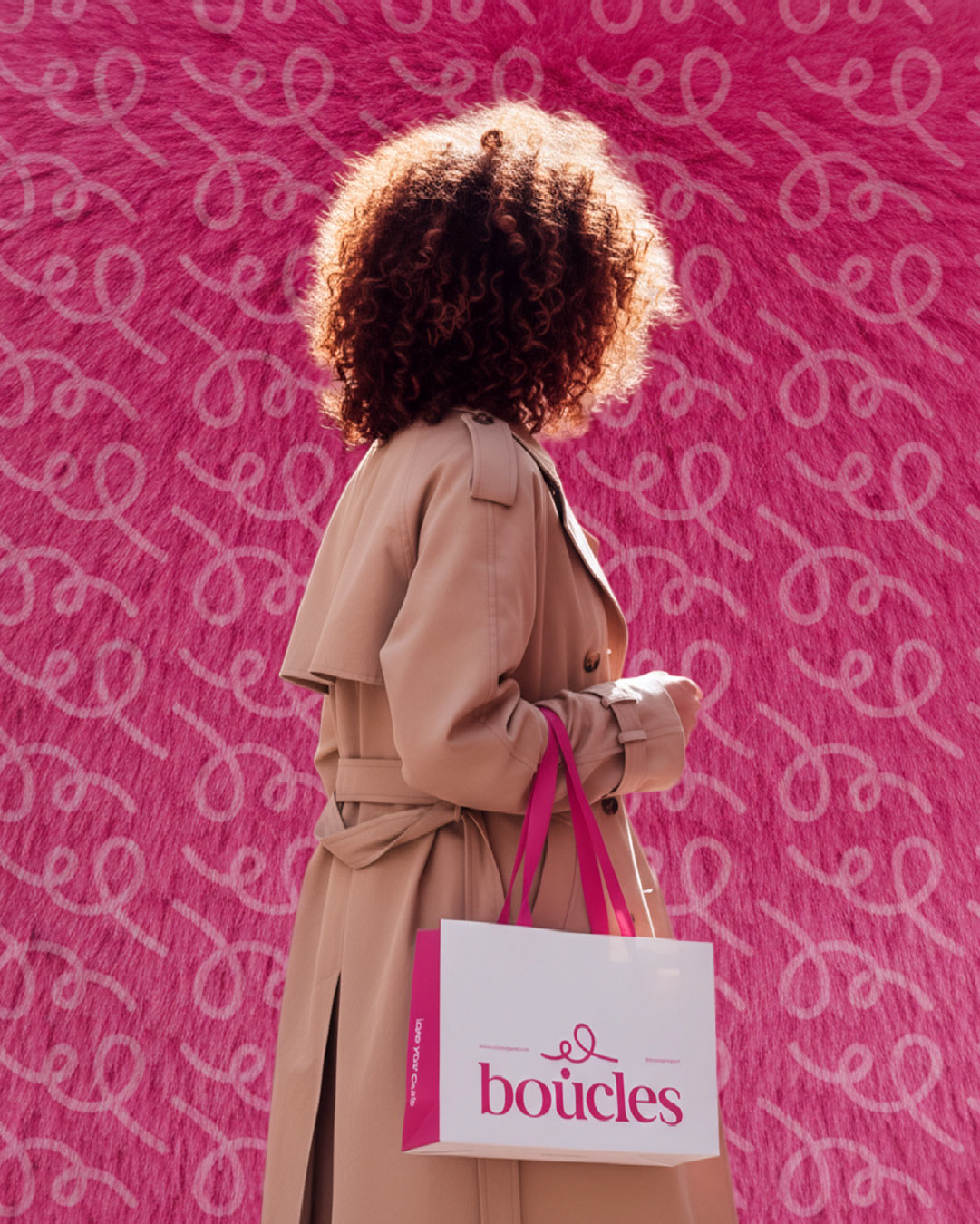
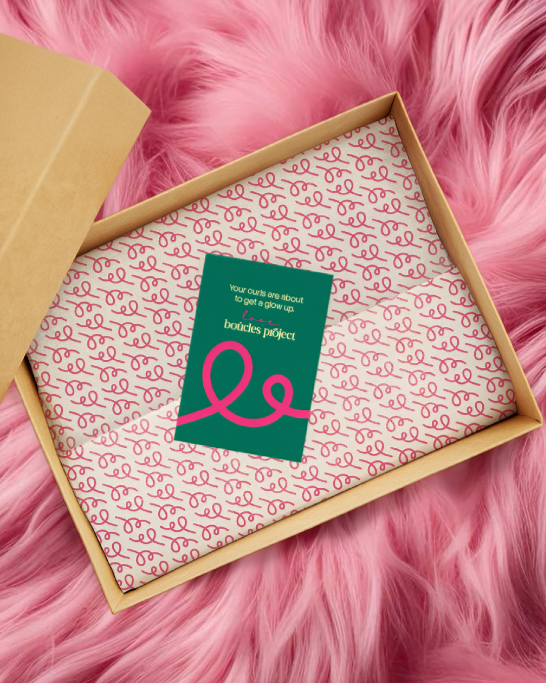
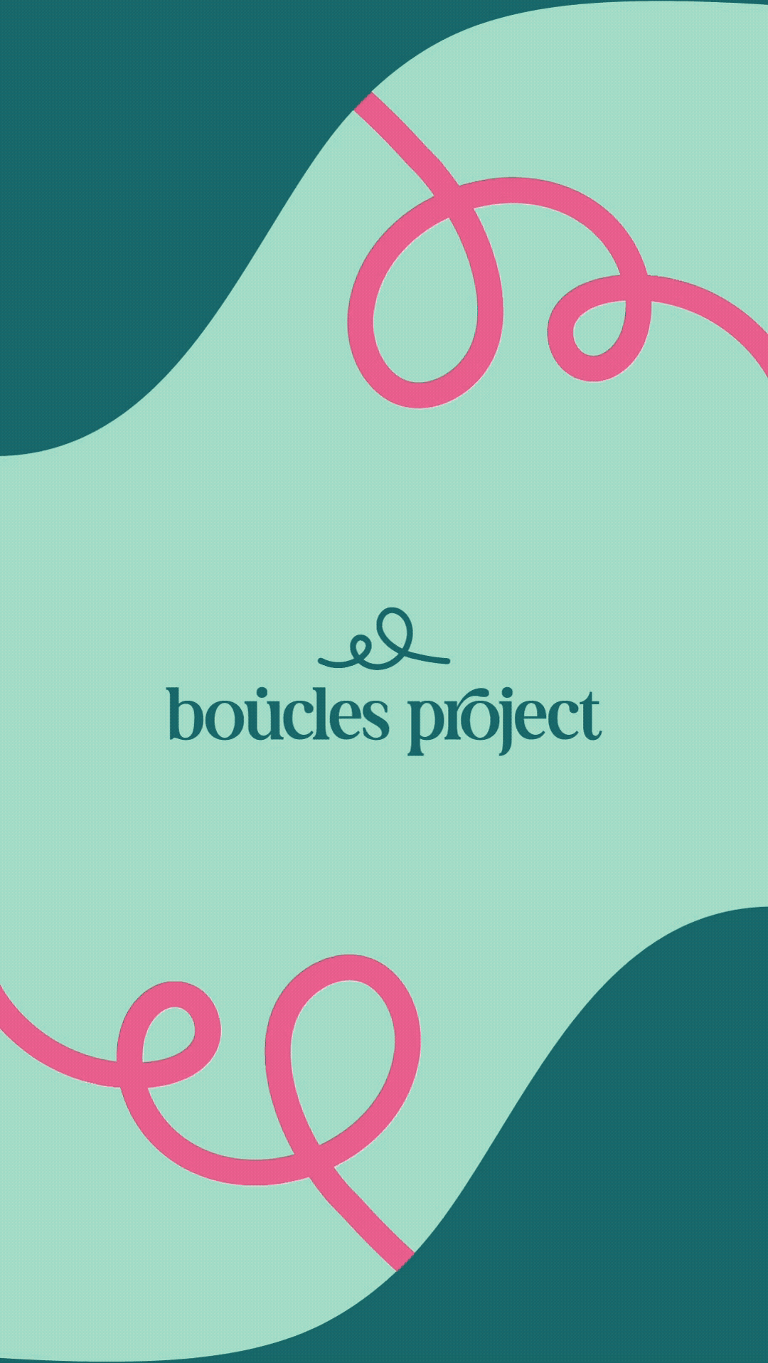
They chose the path that felt most like them: vibrant, elevated, and unmistakably Boucles Project. The pink stayed. Everything around it was rebuilt: logo suite, colour system, typography, brand guidelines, packaging design, event assets, and a website refresh to match.
Every touchpoint was considered as part of a whole. Because for an umbrella brand, consistency isn't a nice-to-have. It's the product.

MOODBOARD OPT 03 - CHOSEN BY THE CLIENT ↑

MOODBOARD OPT 01 ↑

MOODBOARD OPT 02 ↑
THE RESULT
The rebrand launched on social media with a before-and-after reveal: a reel and a series of posts that let the evolution speak for itself. The response was immediate.
The unified identity across packaging, digital, social, and events positioned Boucles as a brand with genuine authority in its space. Shortly after launch, they solidified their B2B offering and secured new stockists.
The feeling: Vibrant, young, and completely at home in a social-first world. A brand that grew up without losing what made people love it in the first place.
"The rebrand reintroduced us to our customers with a fresh, modern look. The response was amazing. We were worried people would feel strange moving away from our previous emblem, but the rebrand was designed so cleverly that customers understood it as a clear evolution."
— Sama Meibar, CEO