
What a Brand Identity Actually Includes (And What You're Missing If You Only Got a Logo)
Brand identity design, visual identity, logo vs brand. These terms get used interchangeably.
They shouldn't.
Most founders think they've done branding when they have a logo.
They've picked a font. Chosen some colours. Maybe commissioned a mark from a designer on a platform that promised a 48-hour turnaround. Job done. Brand sorted. Back to the actual business.
Then six months later, the Instagram grid looks inconsistent. The pitch deck doesn't match the website. The business cards feel like they belong to a different company. The brand that was supposed to make them look credible is quietly undermining them at every turn.
The logo was never the problem. The logo was never the solution either.
Here's what a brand identity actually is, and what most people are missing when they think they've already built one.
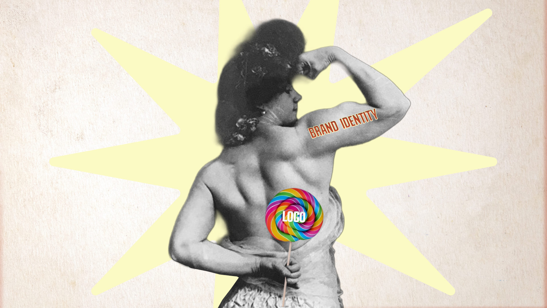
A logo is a mark. A brand identity is a system.
Think of a logo the way you'd think of a front door. It's important. It's the first thing people see. It needs to work. But a front door on its own isn't a house, and a logo on its own isn't a brand.
A brand identity is the complete visual language of your business. Every decision about how your brand looks, feels, and communicates, and crucially, how those decisions stay consistent across every single place your business shows up.
That includes the obvious things. And the things most people don't think about until it's too late.
What a complete brand identity actually contains
The logo suite
Not just one logo. A suite. A primary mark, a secondary version, a stacked version, a monogram or icon for small applications. A brand that only has one logo configuration will break: on a favicon, on a business card, on a social profile picture. The mark needs to work at every size and in every context.
The colour system
Not just a palette. A system. Primary colours, secondary colours, rules for how they combine, how they work on light and dark backgrounds, what proportion each colour gets used. A colour palette without usage rules is just a mood board.
The typography
Again, not just a font. A hierarchy. A primary typeface for headlines, a secondary for body copy, rules for size, weight, spacing, and how they work together. Typography does more for brand recognition than most people realise. It's the voice before the words.
The visual language
This is where most logo-only brands fall apart. Visual language covers everything that isn't technically a logo: the photography style, the illustration approach, the graphic devices, the textures and patterns, the way images are cropped, the layouts that feel distinctly like you. This is the difference between a brand that looks consistent everywhere and one that looks like it was made by five different people on five different days.
The brand guidelines
All of the above, documented. Not a PDF that lives in a folder no one opens. A working document that tells you, your team, your printer, your social media manager, and anyone else who touches your brand exactly how to use it correctly. Without this, even the best-designed identity degrades over time.
What happens when you only have a logo
The short answer: inconsistency. And inconsistency signals inexperience, even when the business behind it is anything but.
A founder with a strong service and a patchy visual identity loses pitches to competitors who look more put-together. Not because the competitor is better. Because they look like they are.
It also creates a hidden cost in time. Every time you need a new piece of content, a new slide deck, a new social graphic, someone has to make a decision: what font? What colour? What style? Without a system, those decisions get made from scratch every time. They won't always be consistent. The brand slowly fractures.
The difference between Brand Identity and Brand Universe
If you're building from scratch (no positioning, no naming, no strategic foundation) you need more than a visual identity. You need the full picture.
A Brand Universe starts with strategy: who you are, who you're for, what you're actually saying and how you say it. Naming, positioning, tone of voice. Then the visual identity is built on top of that foundation, not instead of it.
A Brand Identity project is for founders who've already done the thinking. They know who they are. They know who they're for. They just need a visual world that actually reflects it.
Both are complete. They just start from different places.
The question worth asking
Before you invest in a brand identity, there's one question that will tell you where you actually stand:
If every logo was removed from your brand materials right now, would someone who knows your business still recognise them as yours?
If the answer is no, or you're not sure, that's the gap a complete brand identity is built to close.
Beef Design Studio builds brand identities for founders and businesses who are serious about how they show up. If you're not sure where to start, our Brand Diagnostic gives you an honest read on what's working and what isn't, before any commitments are made.